
Overview
8 weeks | Carnegie Mellon University
At the conclusion of the first semester of CMU Design's first semester, designers are asked to write, design, and fabricate a book that explains our viewpoint of what design is to a non-expert reader.
Problem Statement
Designers put great care into refining their practice.
Good designs are hard to come by though. Failure is far more common than success.
Learning to design is learning to fail—and loving the fall.
Roles
Concept design, illustration, content writing, bookbinding
Tools
Procreate, Adobe Illustrator, Adobe InDesign, Fusion 360, Laser Cutting
Design Intents
•Capture the beginner experience and mentality
•Draw parallels between the importance of mindset in climbing and the culture of Design Thinking
•Use elements of the book's design to focus on the visceral experience of learning
•Craft an experience with immediate impact and engagement. Achieve depth through pacing.
•Draw parallels between the importance of mindset in climbing and the culture of Design Thinking
•Use elements of the book's design to focus on the visceral experience of learning
•Craft an experience with immediate impact and engagement. Achieve depth through pacing.
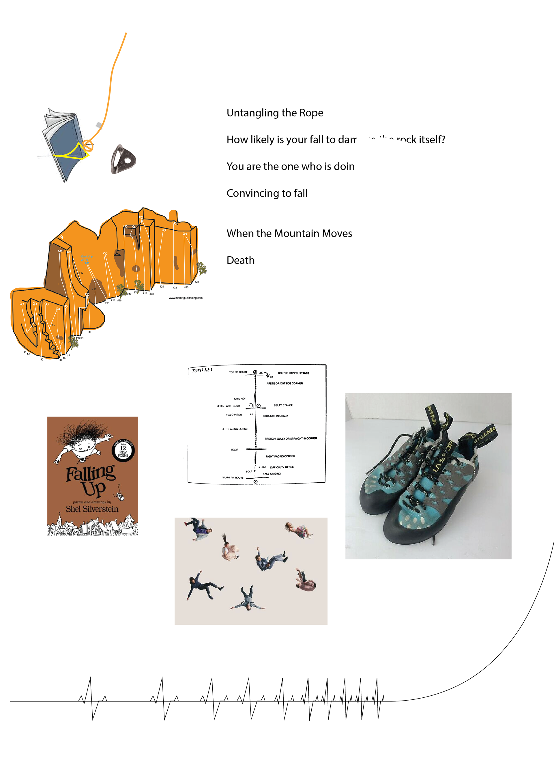
Inspiration
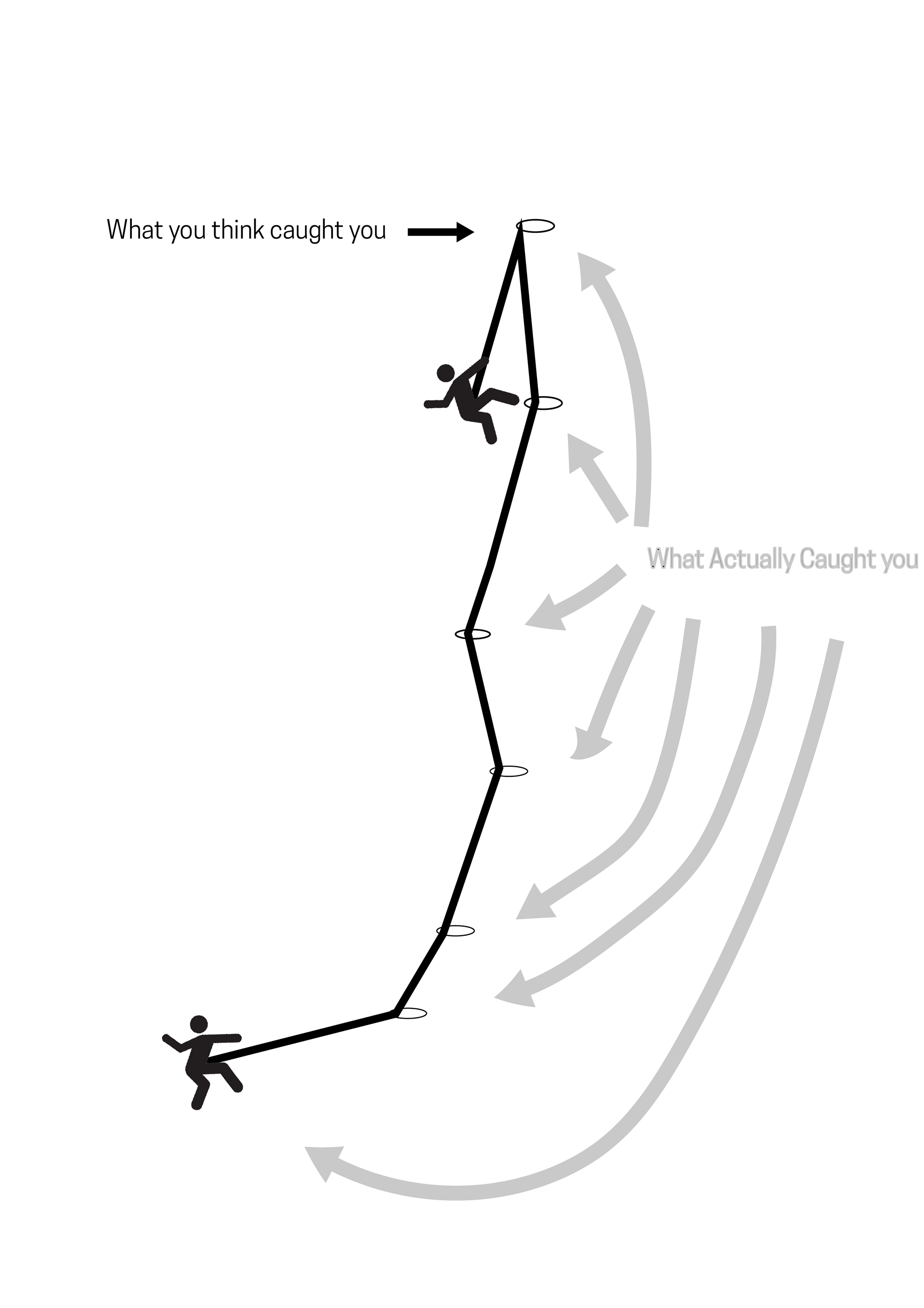
Physicalizing failure
The first time I heard about design was while talking to Industrial Designers in between climbs at a rock gym in Brooklyn. The context of those conversations has shaped my perspective ever since.
As Marketing Coordinator of Brooklyn Boulders, I helped solidify a partnership between the First-Year Studio of the Pratt Industrial Design graduate program. Their students undertook a brief to design climbing equipment for a professional climber and in return, I provided climbing instruction and guidance on how to navigate the very constrained design space of designing for climbing.
Although, I didn't know how to articulate it fully, I did start to understand similarities between the ways both designers and rock climbers use iteration and a culture of positive failures to solve problems that appear impossible from the outset.
The way climbers fall, and the way designers iterate isn't just an unfortunate byproduct. That mindset of understanding that failure is the engine that drives success.
Approach
Walking the walk
Given the message I was trying to communicate, I wanted to approach my design like a climber. To me that meant scrappy, expressive iterations.

One
Intent
For the first round of iteration, I wanted to try and mine the experience of falling. I knew that one thing a climber learns (sometimes subconsciously) is how to fall. Beyond the biomechanics of it, I knew that part of learning is understanding that falling isn't binary. From the moment that you start to think you might fall, to the point of impact, there are a million opportunities for micro-adjustment.
Outcome
Showing this to our professor and my peers, I could see that my users could conceptually link the form and message, but there was something unsatsifying and intellectual about the association.
Failure is an emotional experience too.
Two
Intent
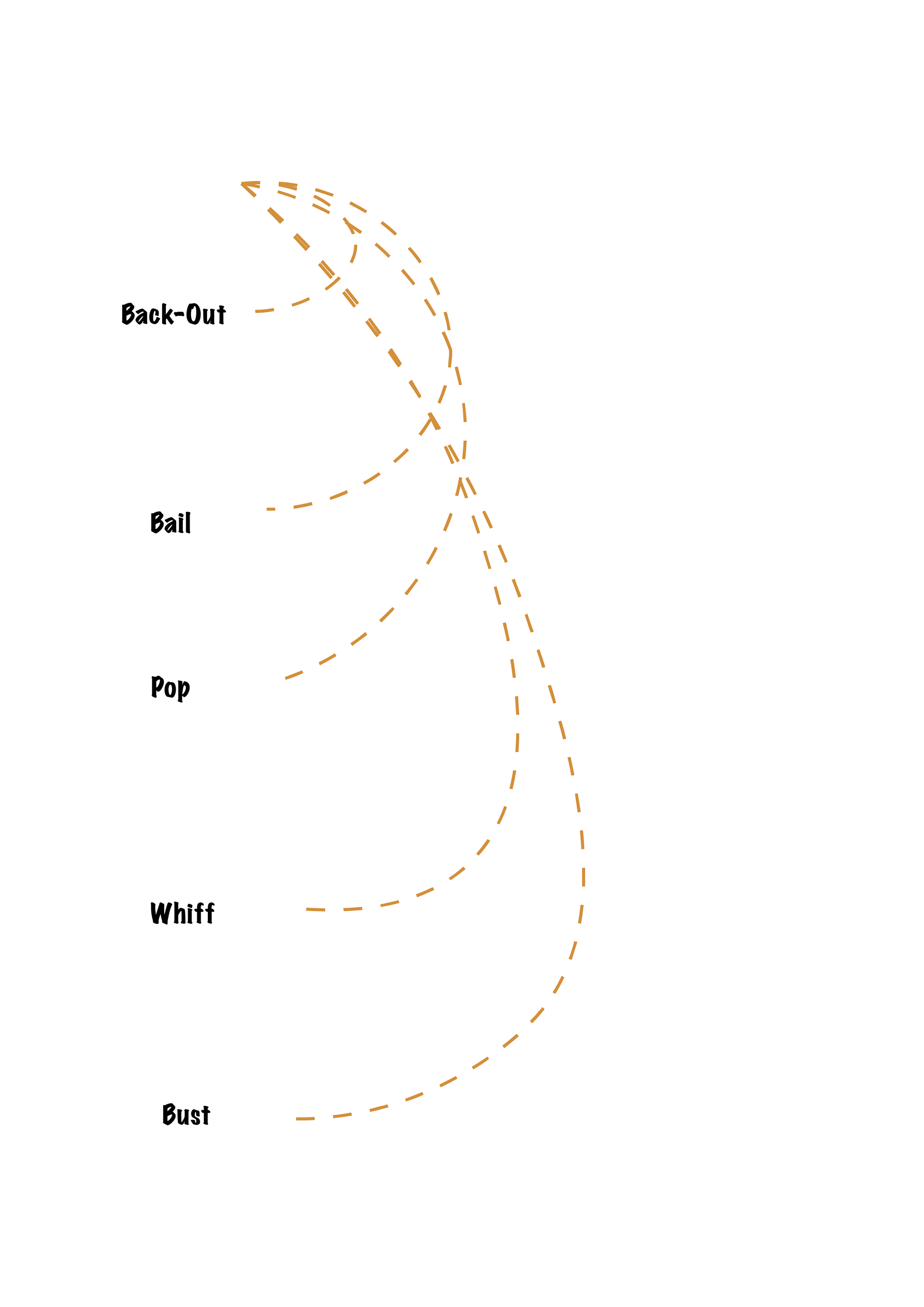
Explore ways to visually capture the experience of liberating weightlessness when an experienced climber falls.
Communicate the multiplicity of falls and the spectrum of failures.
Outcome
This starts to work for audiences that know a lot about either climbing or Design theory, but the experience isn't immediate. For some, it may take too long and require too much effort to crack.
Three
Intent
Create an immediate experience the creates engagement and curiosity that frames the experience and carries a reader through the finer details of the text.
Outcome
Definitely on to something here. Giving the reader a moment to choose to dive in is powerful.
Final Visual Forms
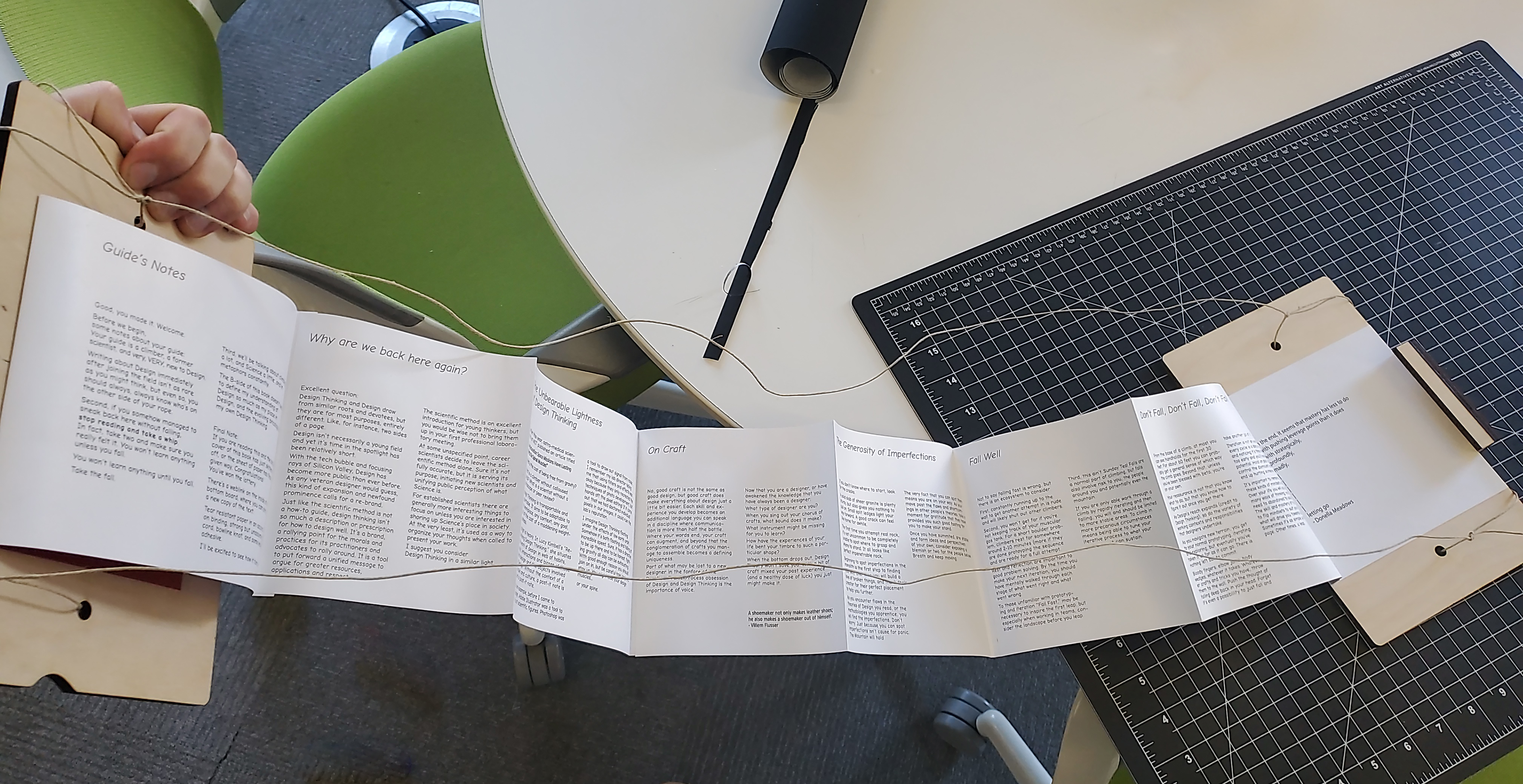
With the format of the book down, I then turned towards the various visual elements of the book to help readers tie together the shared cultures of failure of climbing and design.
The first place I looked for inspiration was the Topo booklets that climbers used to scrawl out information about the routes they climbed.
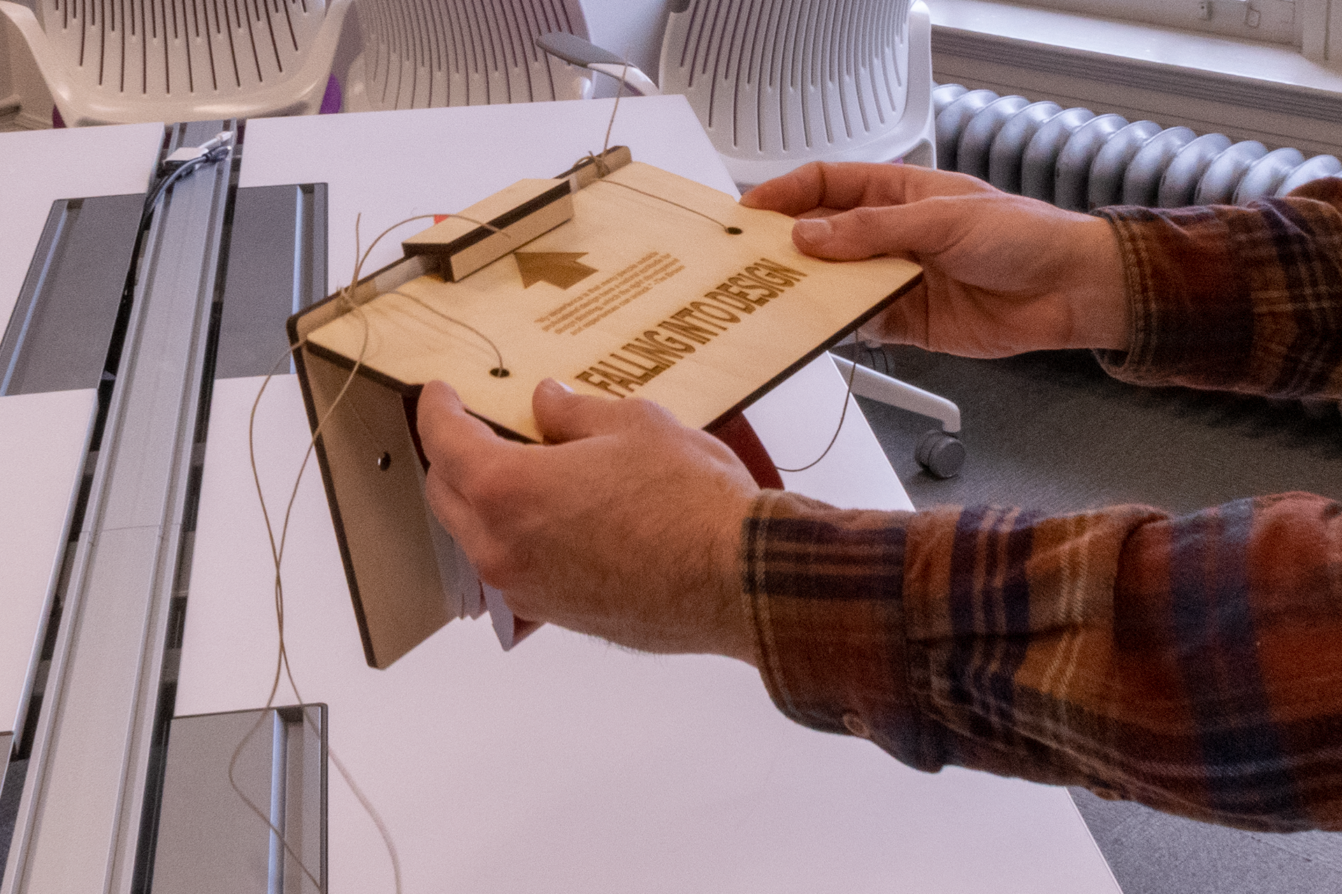
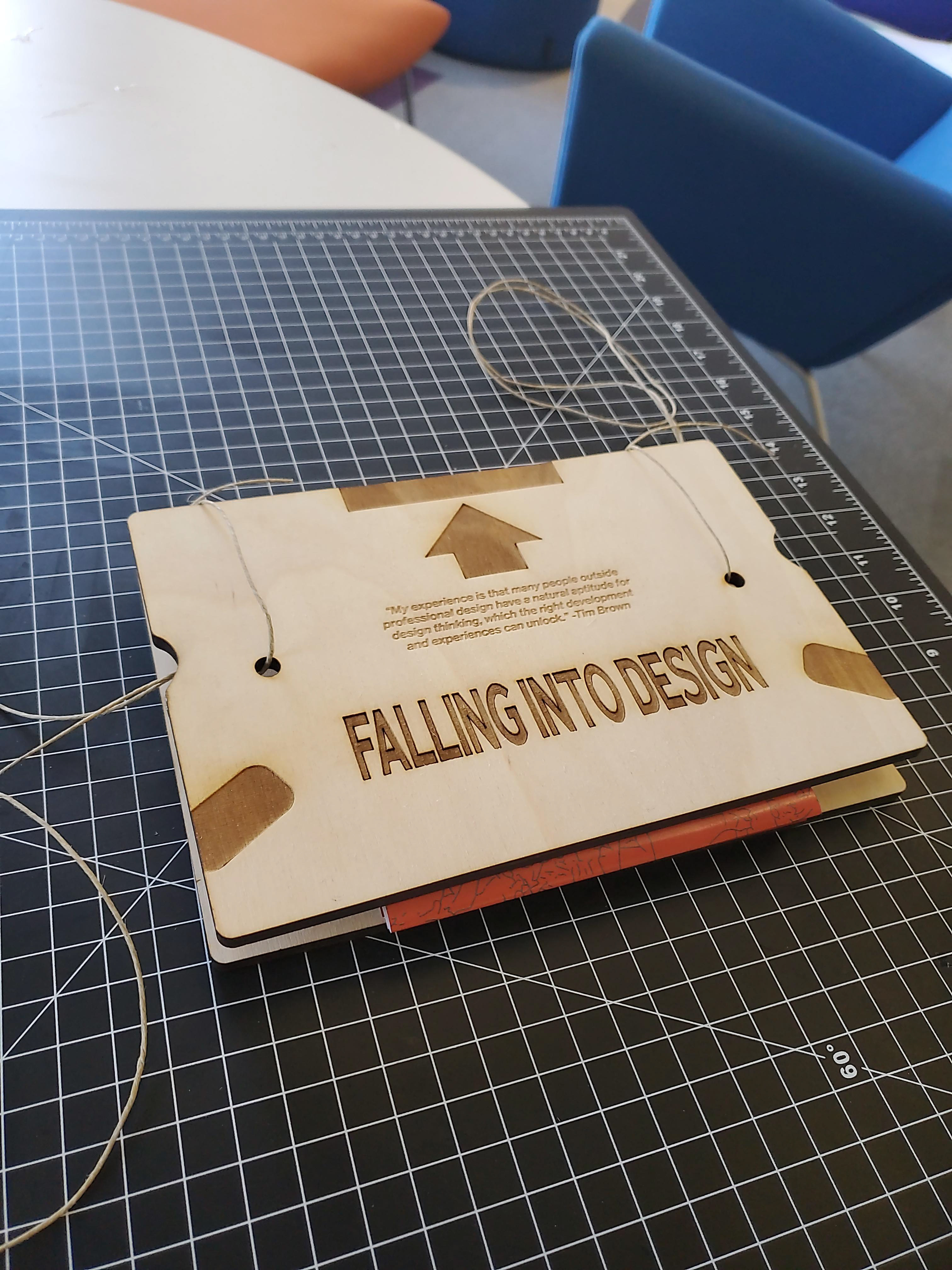
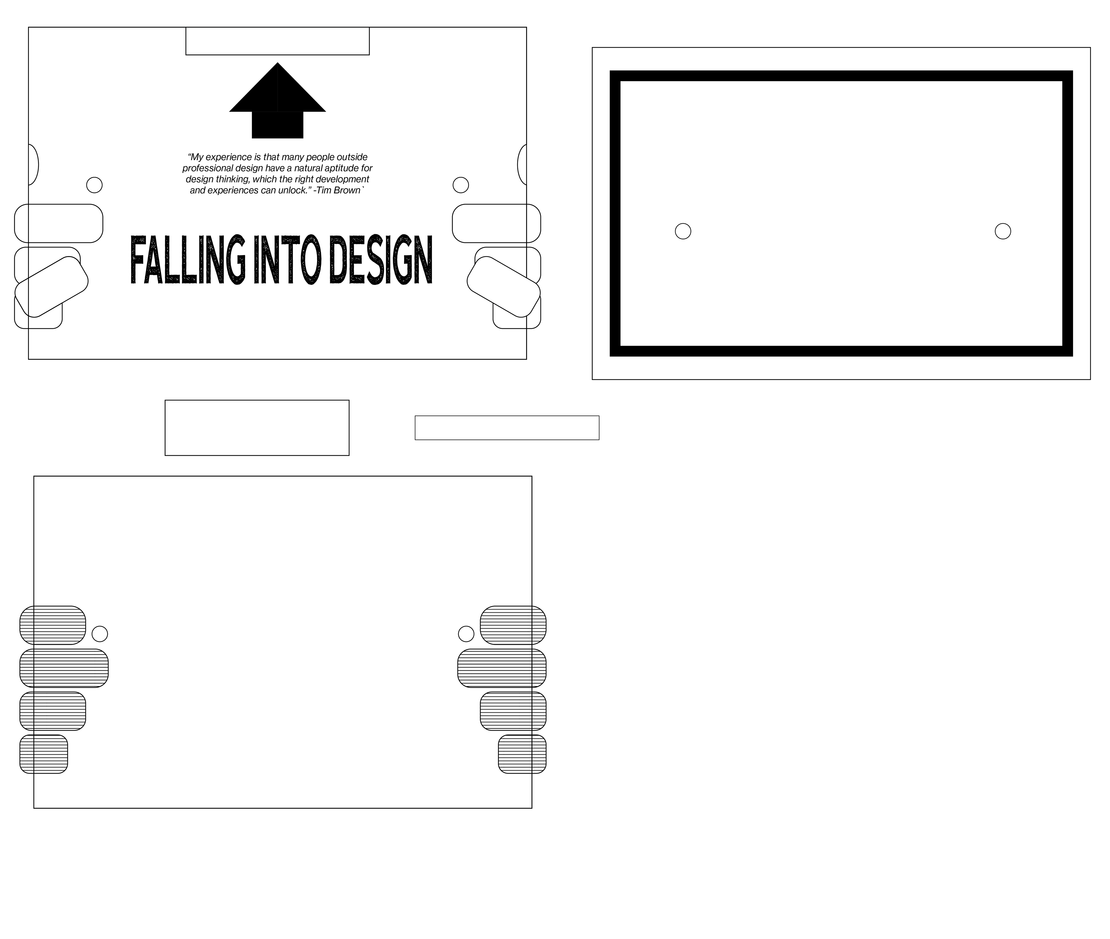
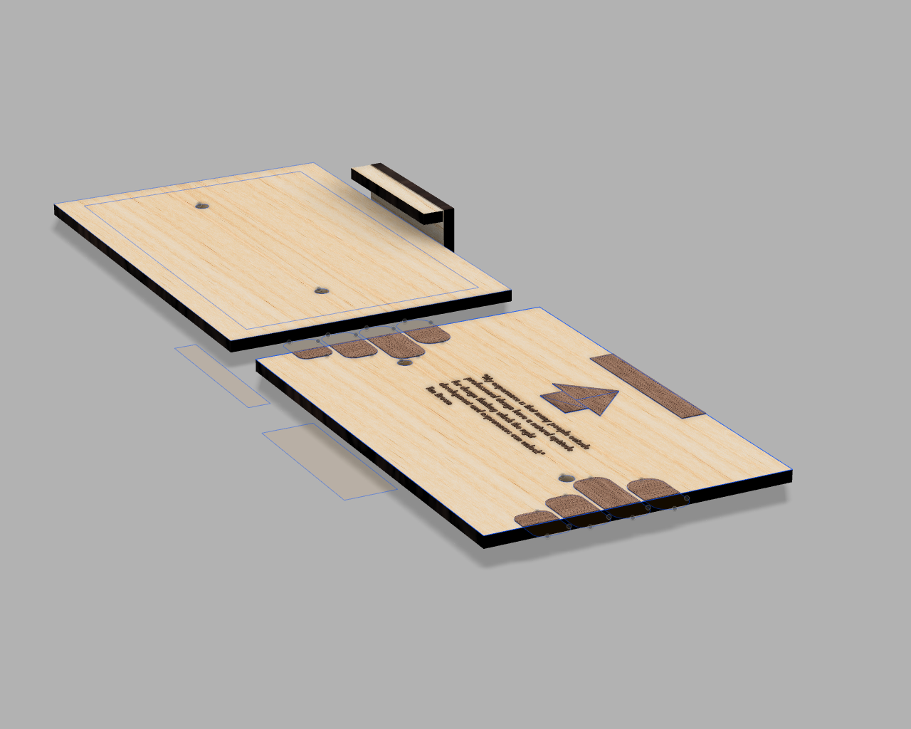
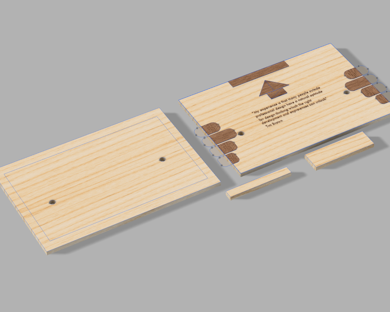
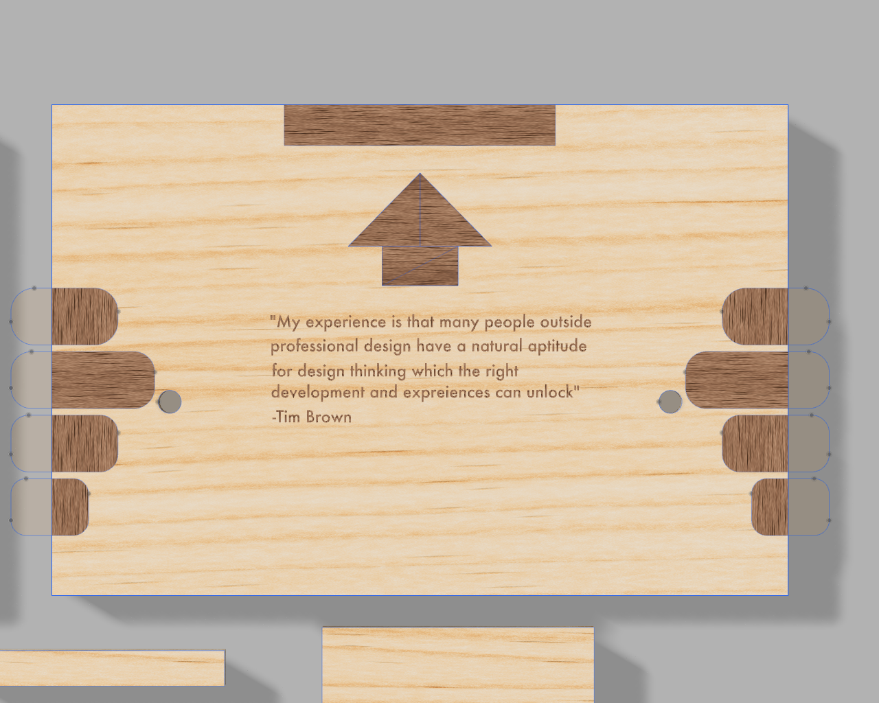
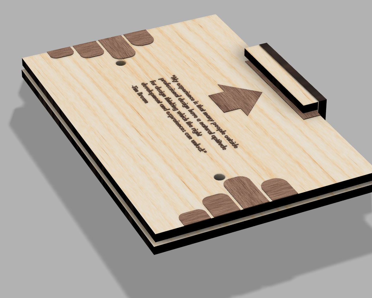
Cover
I chose a wood cover both as an aesthetic cue, but also to address what I noticed as a slight hesitation to interact with the book to its fullest extent when the cover was made with traditional materials. I needed my readers to be comfortable dropping the thing to keep their attention mindful to the experience of dropping.
The cover also targets the first moments of beginning to design. As with many designers, we are often ushered into the field by a quote like Tim Brown's. Once our curiosity is sparked, we might choose to take the leap.
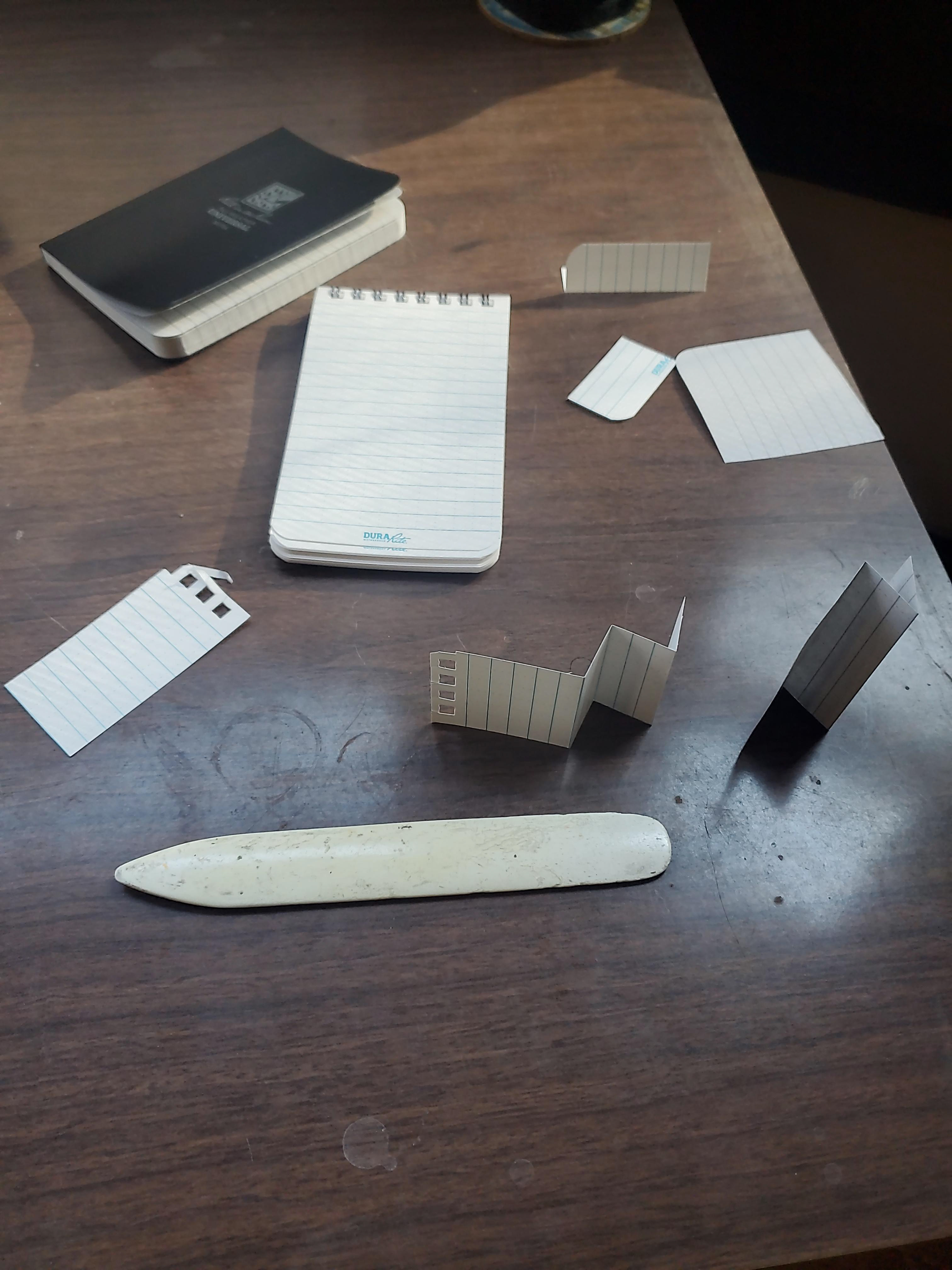
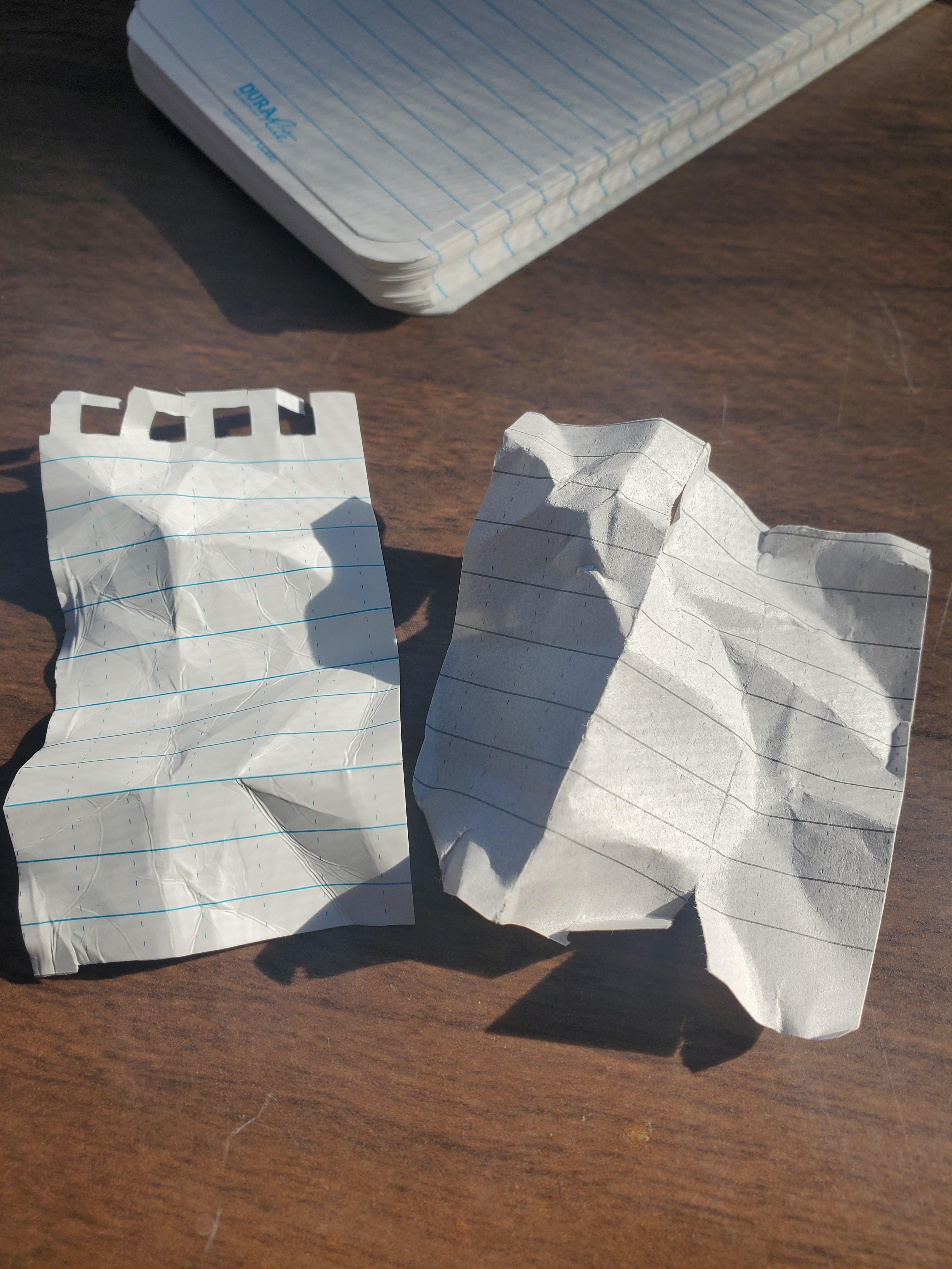
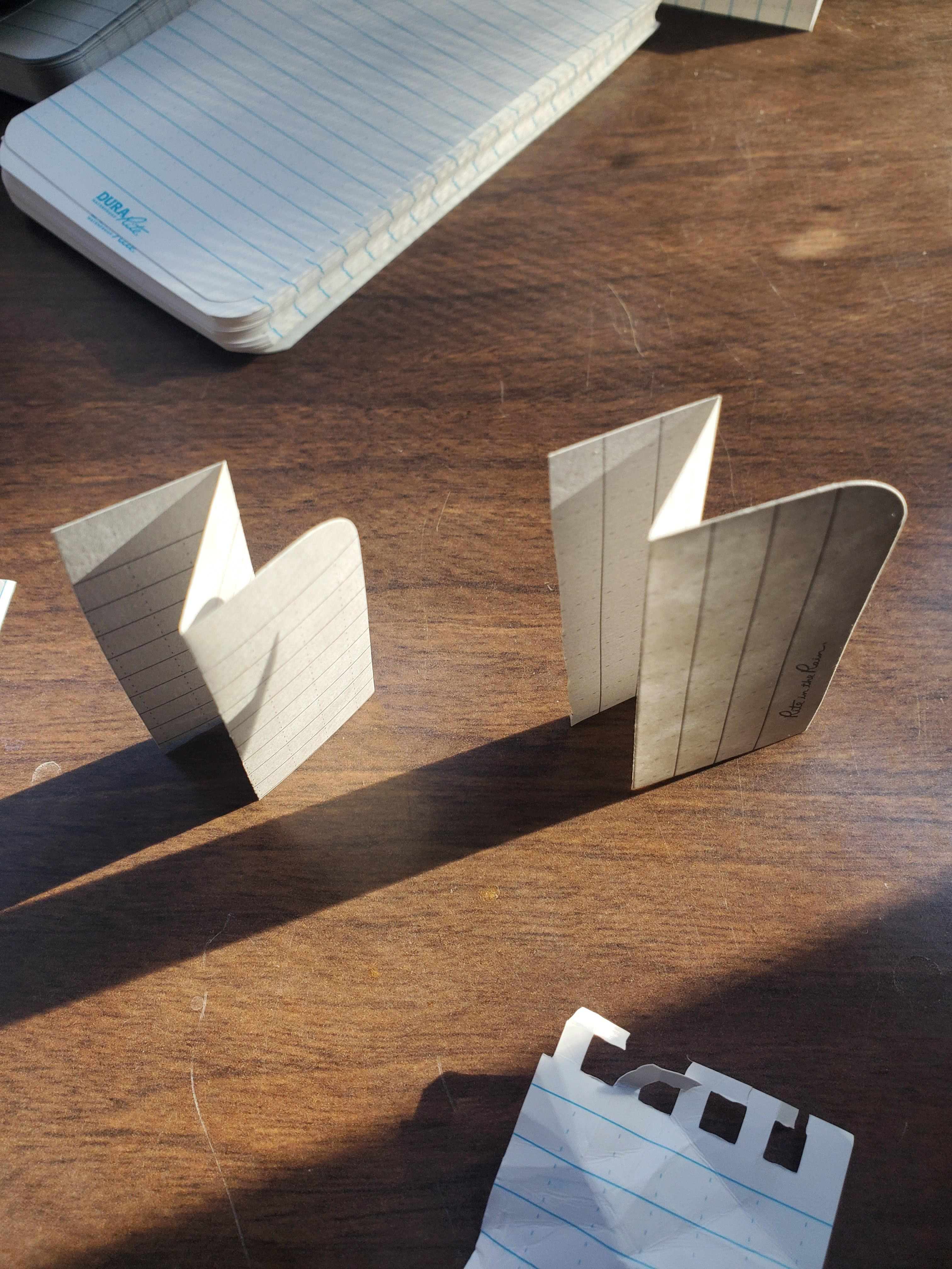
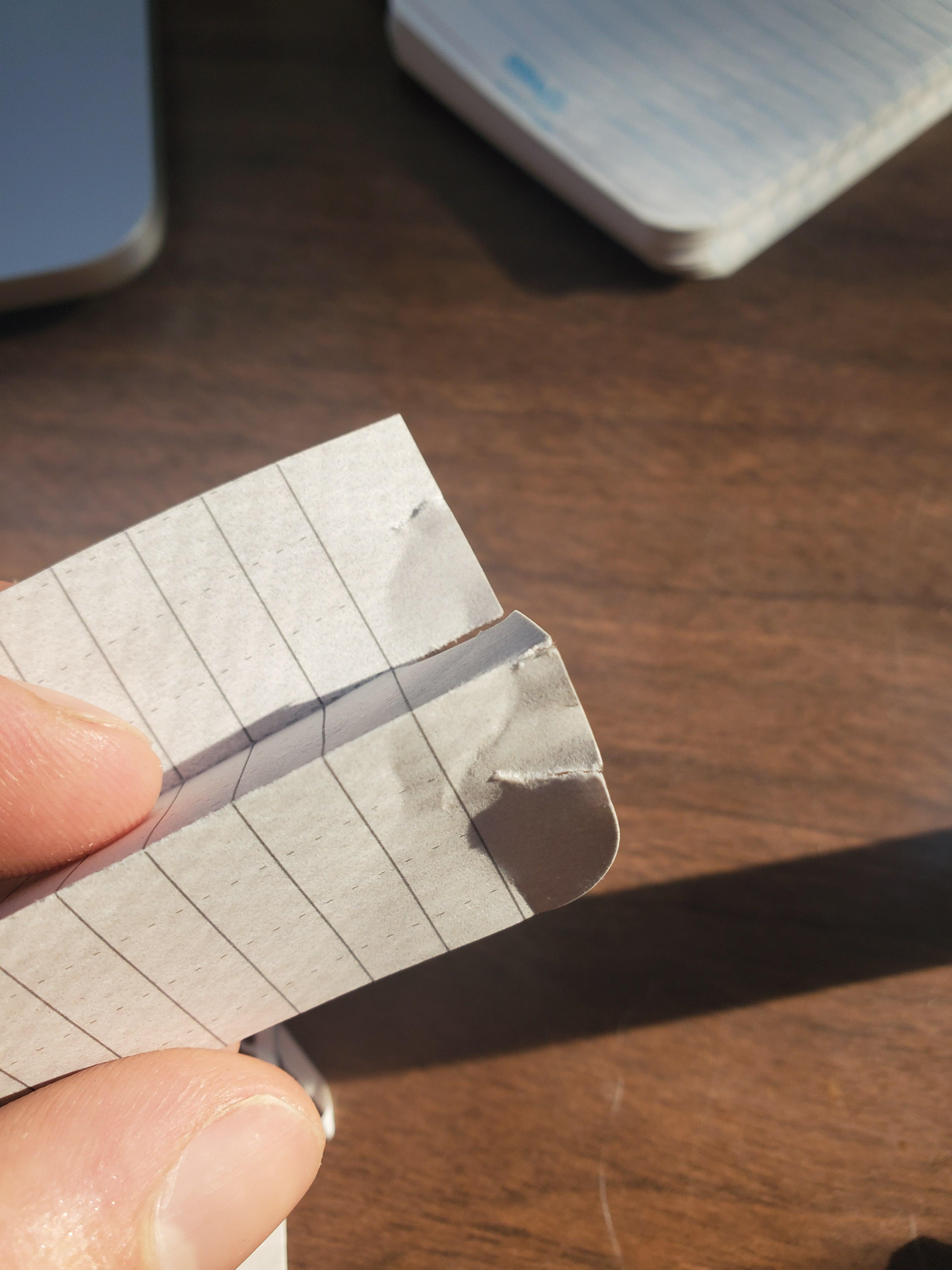
Paper
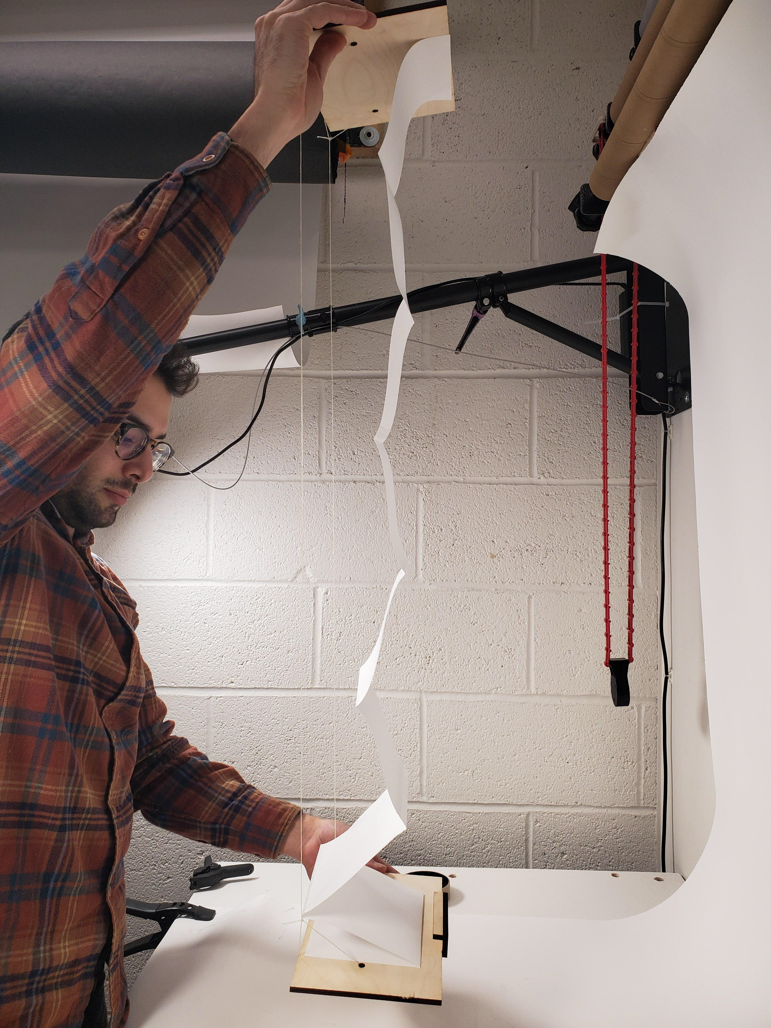
It took a few tries to find paper that would be suitable for a drop-ready book. Through trial, error and by consulting with some true paper sages, I was able to finally settle on paper that was
•Durable
•Printer-friendly
•Foldable, but also wrinkle resistant
•Glue-able into an accordion fold binding
•Printer-friendly
•Foldable, but also wrinkle resistant
•Glue-able into an accordion fold binding
By clearly identifying what properties I needed from the paper before assembling the final book, I was able to put multiple paper types through a range of testing to find one that fit my requirements.
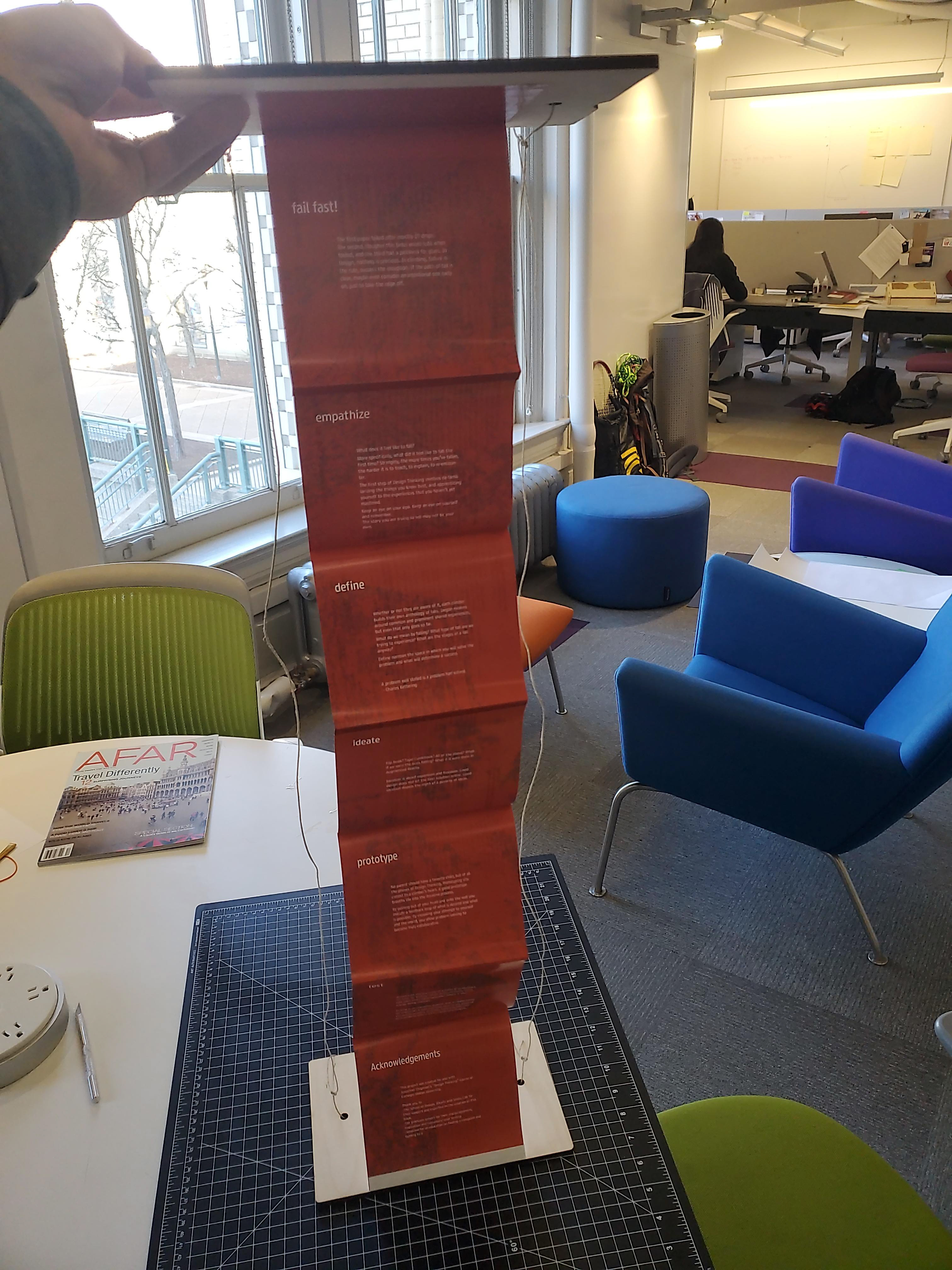
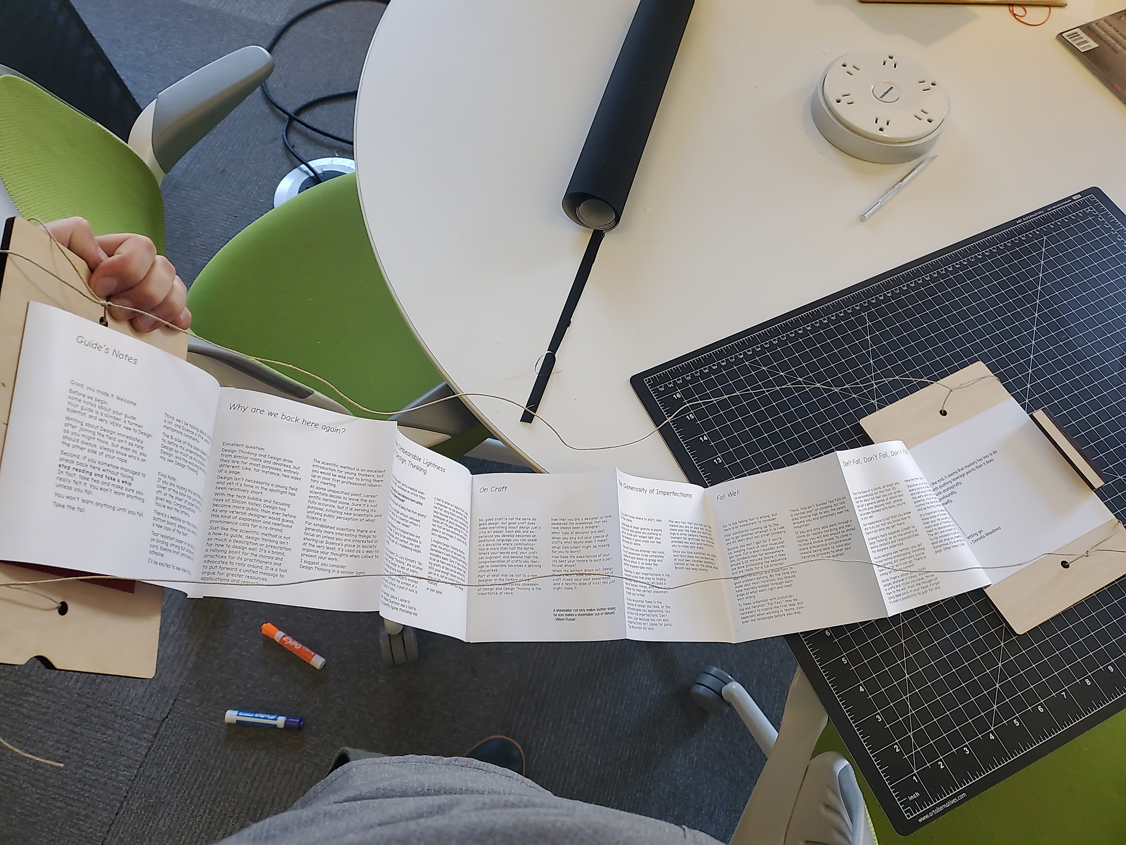
Layout and Experience Design
1. Before the book is dropped, the cover sparks a reader's curiosity. A brief pause before it drops gives special emphasis to the choice of taking the plunge into design
2. After the drop, the reader sees a colorful text layout with snappy text describing many of the attractive aspects of using design to solve problems. Often times, principles and statements like these are our first introduction into how design works, the ones that welcome us to the discipline. This is the mass market Design Thinking, created to applied by anyone to any problem.
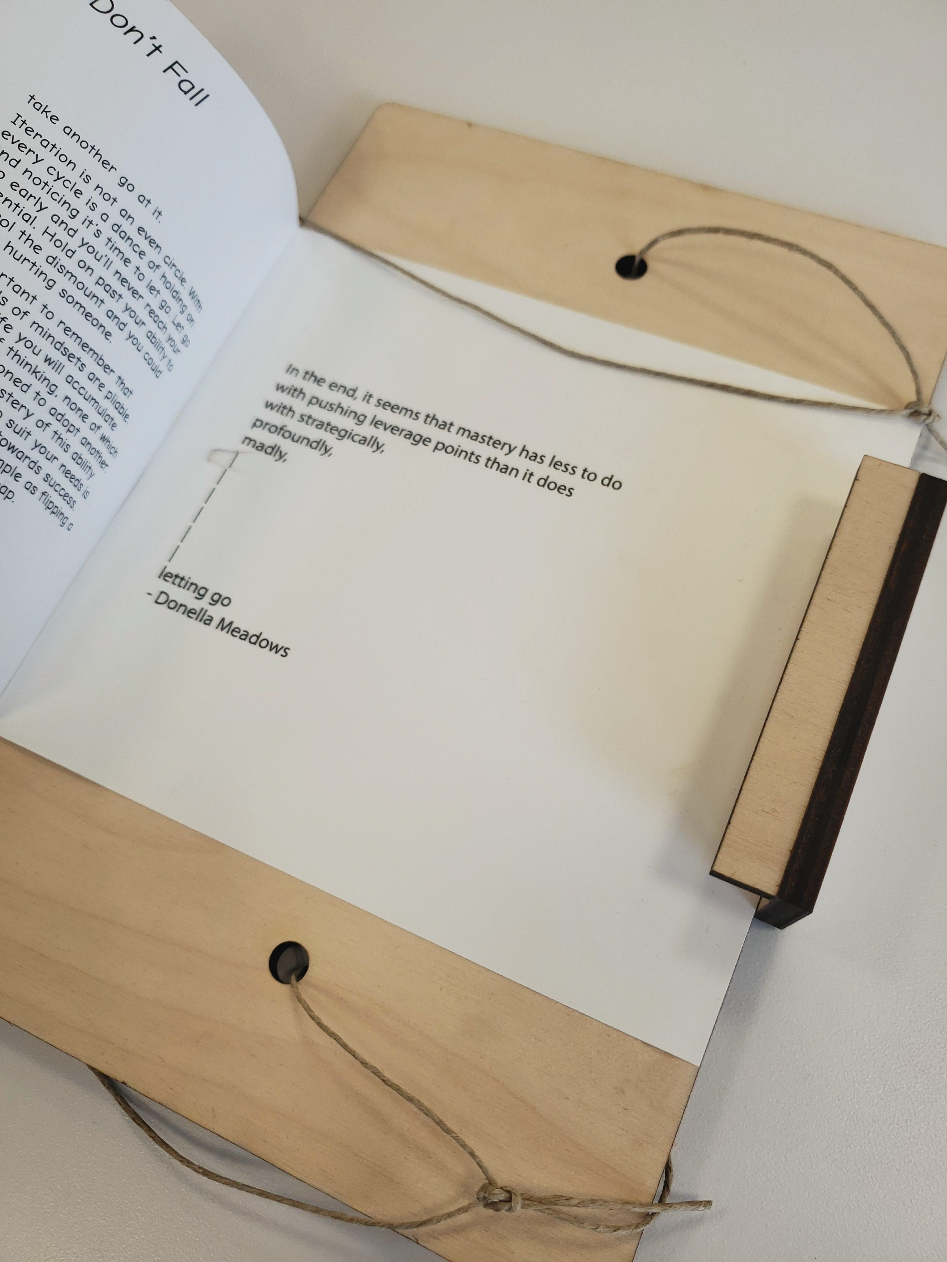
3. For the dedicated and curious reader, there is a reverse print. Here the reader is guided through the deeper secrets of how to design effectively. This section focuses more on mindset than method, not entirely dispelling the mythology of "Design Thinking," but contextualizing it. This section also draws the reader into a methodology of failure and the deeper connections between a climber and designer's mindset and method.

Full Text
(Click through to explore)