How might we design an app for users to
understand and compare how different birth control methods
fit into their lifestyle without introducing stigma
or biasing an assumed treatment?
understand and compare how different birth control methods
fit into their lifestyle without introducing stigma
or biasing an assumed treatment?
At a glance...
12 Weeks | Carnegie Mellon University | FemTech Collaborative
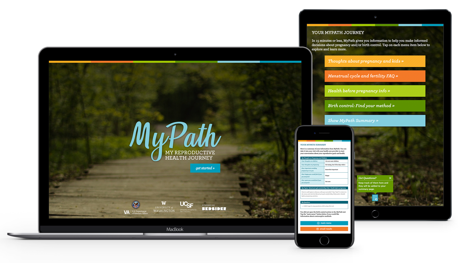
Through user research and iterative design, our team developed a UI brand language, information architecture, and user flows to serve as the basis for the creation of a birth control methods app that would give access to important information outside the doctor's office.
Roles
Branding Design | UX Research | UI Design
Team
Alex Heyison | Catherine Yochum | Mahzi Malcom | Yu Chuan Shan
Tools
Figma | Adobe InDesign
Design Intents
•Prioritize User Agency
•Guide users, drawing focus to chosen methods without closing off others
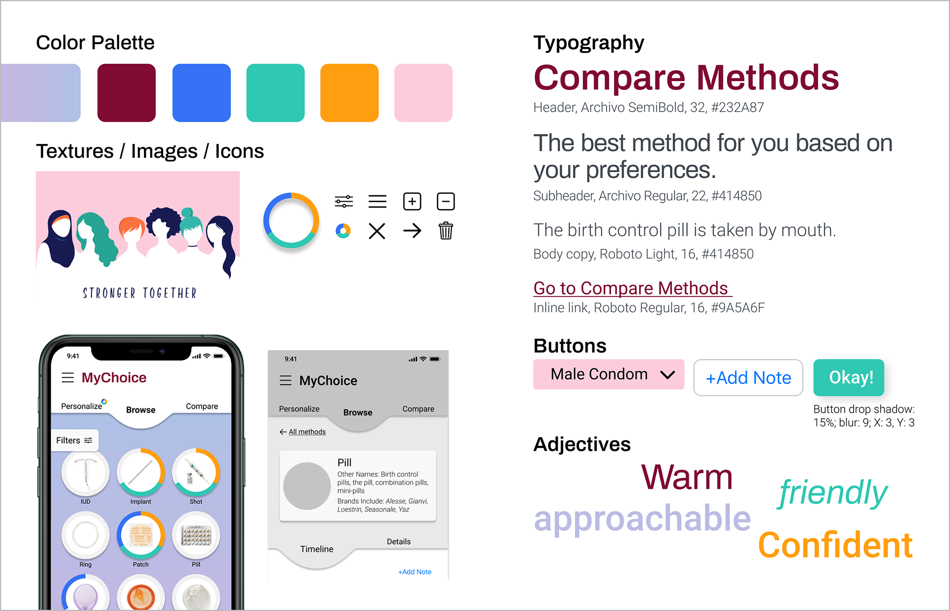
•Create an attractive, approachable, and professional brand language
•Allow comparison by consistent presentation of information
•Set good expectations for the longer timeline of using a method
•Guide users, drawing focus to chosen methods without closing off others
•Create an attractive, approachable, and professional brand language
•Allow comparison by consistent presentation of information
•Set good expectations for the longer timeline of using a method


Our Client
The FemTech Collaborative develops and conducts research on reproductive health technology prototypes.
Up until this project, their prior work has been for technology to be used as an aide in a clinic context alongside a supervising physician.
This project represents their first attempt at developing technology to be used independently outside the clinic.
FemTech Guiding Principles
1. Include community stakeholders in the design, development, and deployment of health technology
2. Ground our technology in person-centered frameworks
3. Advance reproductive health equity.
Background Research
To begin our research we...
1. Interviewed medical professionals at the Magee Women's Hospital
2. Conducted competitive analyses of similar apps on the market
3. Collated relevant academic writing on birth control tools
From what we observed, past attempts at this kind of app struggled to find the balance in how strong of a recommendation they provided. Many used surveys as the basis for choosing a final method, but did so in a way that had dangers of heavily biased questions and outcomes or made recommendations in a way that could engender distrust.
Creating Space for Conversation
For many, birth control isn't just a single decision, but a medical relationship that unfolds over decades.
In our early user research interviews, we were able to work with women of diverse ages and backgrounds, to expand our understanding about how these decisions are actually made.
As we discovered through our user interviews, making decisions about birth control is hard. Beyond the sheer number of available options, finding information that you can trust, compare equally, and consider in context of a user's specific lifestyle adds complexity and stress.
Another key insight was how rarely "choosing a method" was a singular moment or interaction with a doctor. Contrary to what we heard from doctors, many patients weighed options for months before speaking to a doctor. We also heard repeated stories about the months after a method is chosen where a patient evaluated the effects on their body, health and lifestyle. Further, re-evaluation of methods happened as lifestyles or values changed.
From these stories we learned that setting good expectations and reacting to changes over time would be key requirements of our design,
User Interview Insights
1. Birth Control is a personal choice influenced by both health and lifestyle.
2. Conversations on birth control suffer from a trust deficit.
3. Many patients want to feel that they have actively chosen a method for themselves.
4. Decisions happen over time and patients evaluate their choice of method by comparing what they experience to their expectations.
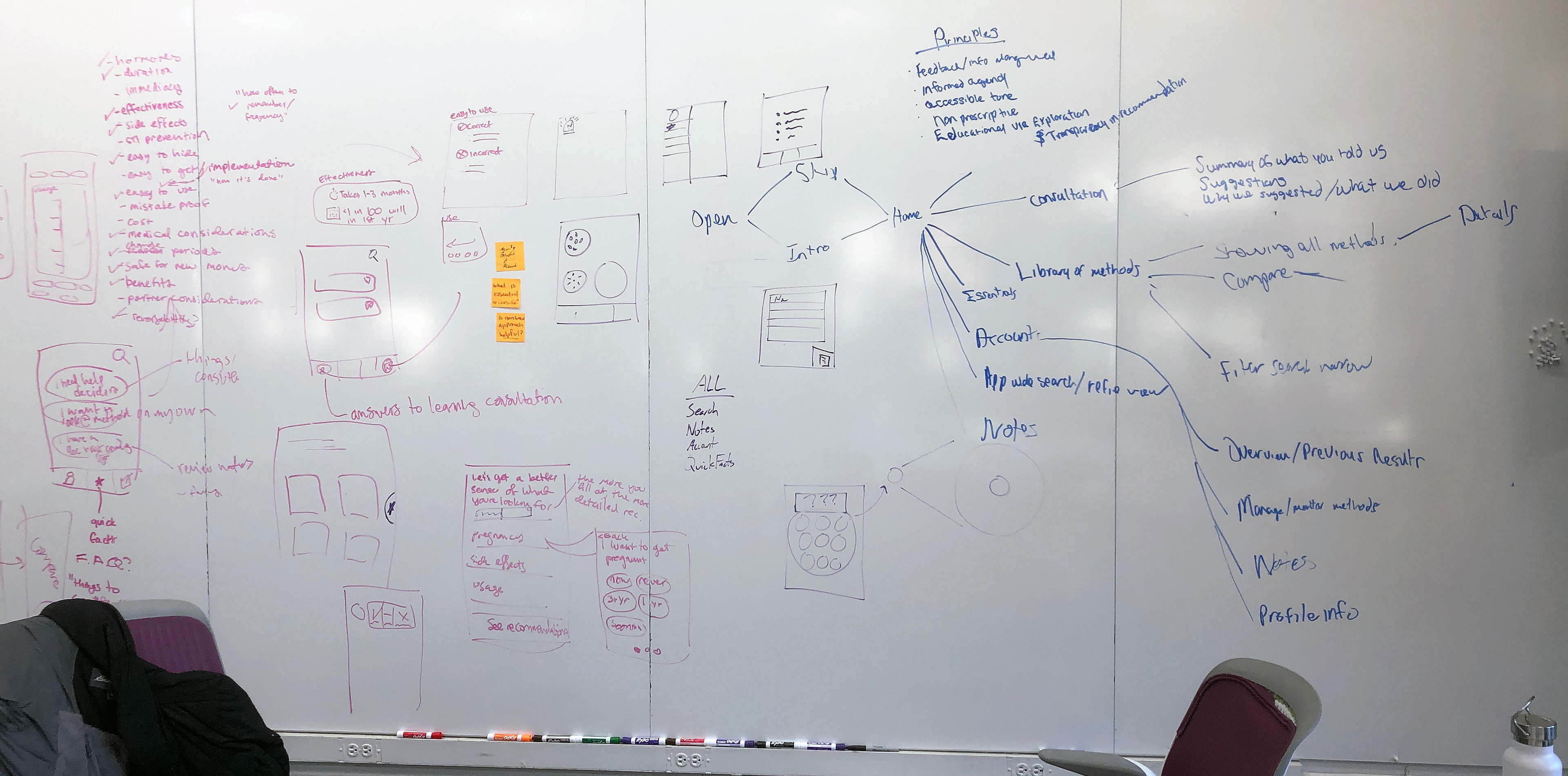
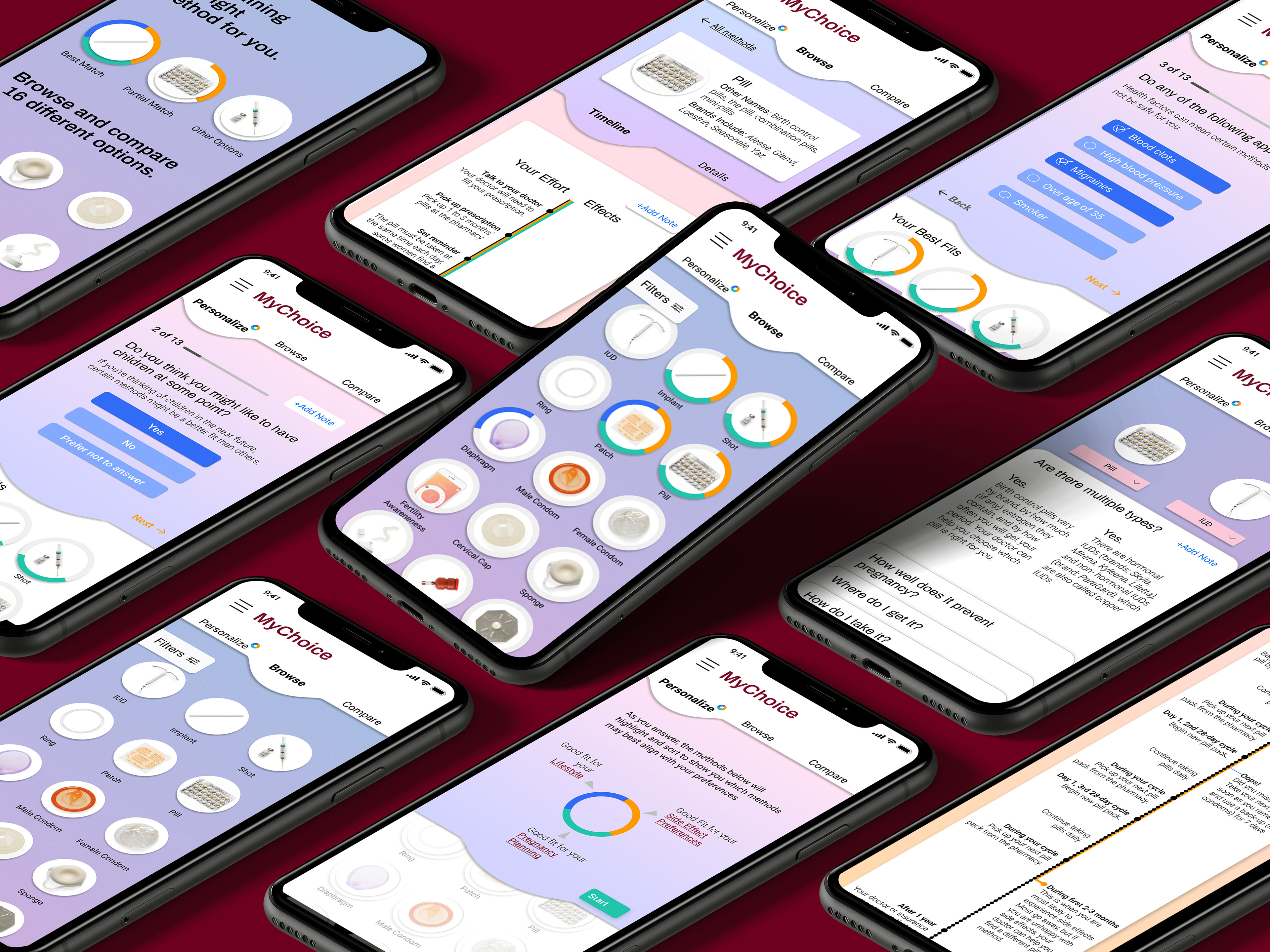
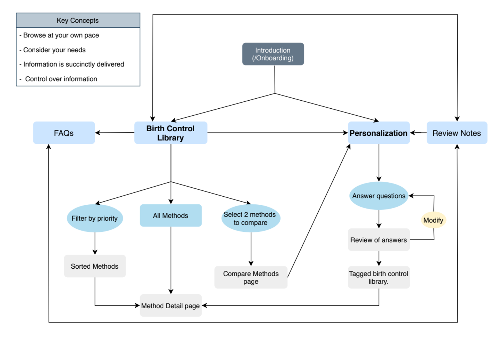
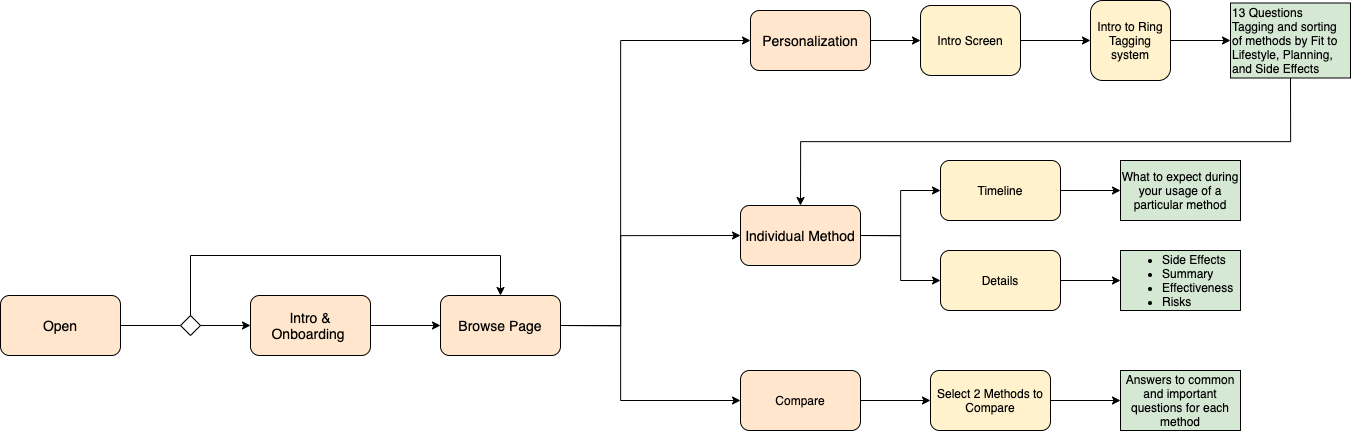
User flow/site architecture
Wireframe Usability Study
Assumptions to test
It is clear what you can expect to find in each section of the app.
What we heard
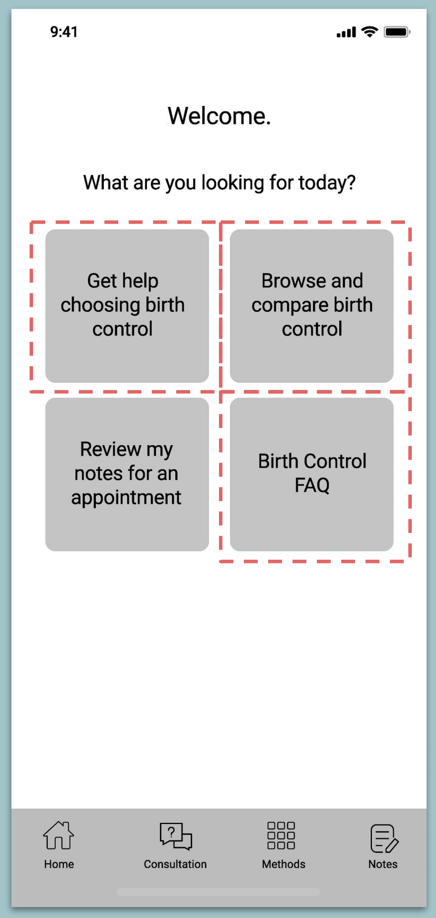
Confusion around whether “Get help”, “Browse and compare”, and “FAQ” were the same thing?
No inclination that “get help” was a series of personal questions.
“What about insurance?”
How that changes our assumptions
We need to find a better way to differentiate the value in each section of the app.
People do not necessarily come to the app looking for something specific.
Proposed changes
Potential hierarchy of options listed (e.g. breaking out birth control FAQ and relabeling it “myths”, “quizlet”, “fact of the day”).
Put some clarification into brief intro/tutorial on app value to set tone (1-3 quick screens).
Assumptions to test
Effectiveness can be represented in a way that allows users to leverage the information in their decision making process.
What we heard
Easy to find key information about the method.
Participant said she expected IUD to be “more effective”
“I might put that information in its own place, above the About IUD category”.
Both participants would have wanted to know about variations within a method.
How that changes our assumptions
“85x more effective” didn’t communicate the message as we expected. We need to think of different ways to represent effectiveness.
Proposed Changes
Adjust the placement of effectiveness information to stand on its own.
It’s very difficult to contextualize effectiveness, re-evaluate visualization
Ensure clear process explanation for trying different brands/hormone
combos on the pill.
combos on the pill.
Assumptions to test
Timeline would give a sense of long term experience of method and
reveal hidden effort or side effect considerations.
reveal hidden effort or side effect considerations.
What we heard
“I don’t have a set structure, I go out, go to the gym, want option to fit
into my schedule...
want to know how this will fit into my life”.
into my schedule...
want to know how this will fit into my life”.
“I think this timeline is important”.
Next Steps
Try to do a timeline for either birth control pills or condoms with a
shorter/less defined timeline.
shorter/less defined timeline.
May think about ways to clarify duration of side effects.
Assumptions to test
People would find it helpful to have questions guide them through their
decision.
decision.
People would want suggestions for “aspects to consider” rather than
specific methods at the end.
specific methods at the end.
What we heard
Users expected these types of questions in a birth control app.
I’m a visual person and I think I’d be disappointed if this didn’t give me
something specific to consider at the end.
something specific to consider at the end.
Participant assumed the end of the consultation would help her
compare methods.
compare methods.
How that changes our assumptions
People may want a more definitive recommendation if they’re going to
be answering questions about their preferences.
be answering questions about their preferences.
Proposed Changes
Evaluate ways to incorporate explicit methods into the
recommendations without introducing bias.
recommendations without introducing bias.
What is the transition back to the library?
Usability Study Insights
There is a wide range of potentially relevant information.
Organize and disclose progressively
Organize and disclose progressively
Users need to know what to expect as they acclimate to a new method
Don't hide away methods, even when filtering. It can cause distrust
While definite selections are suspicious, users do want to feel guided to particular methods
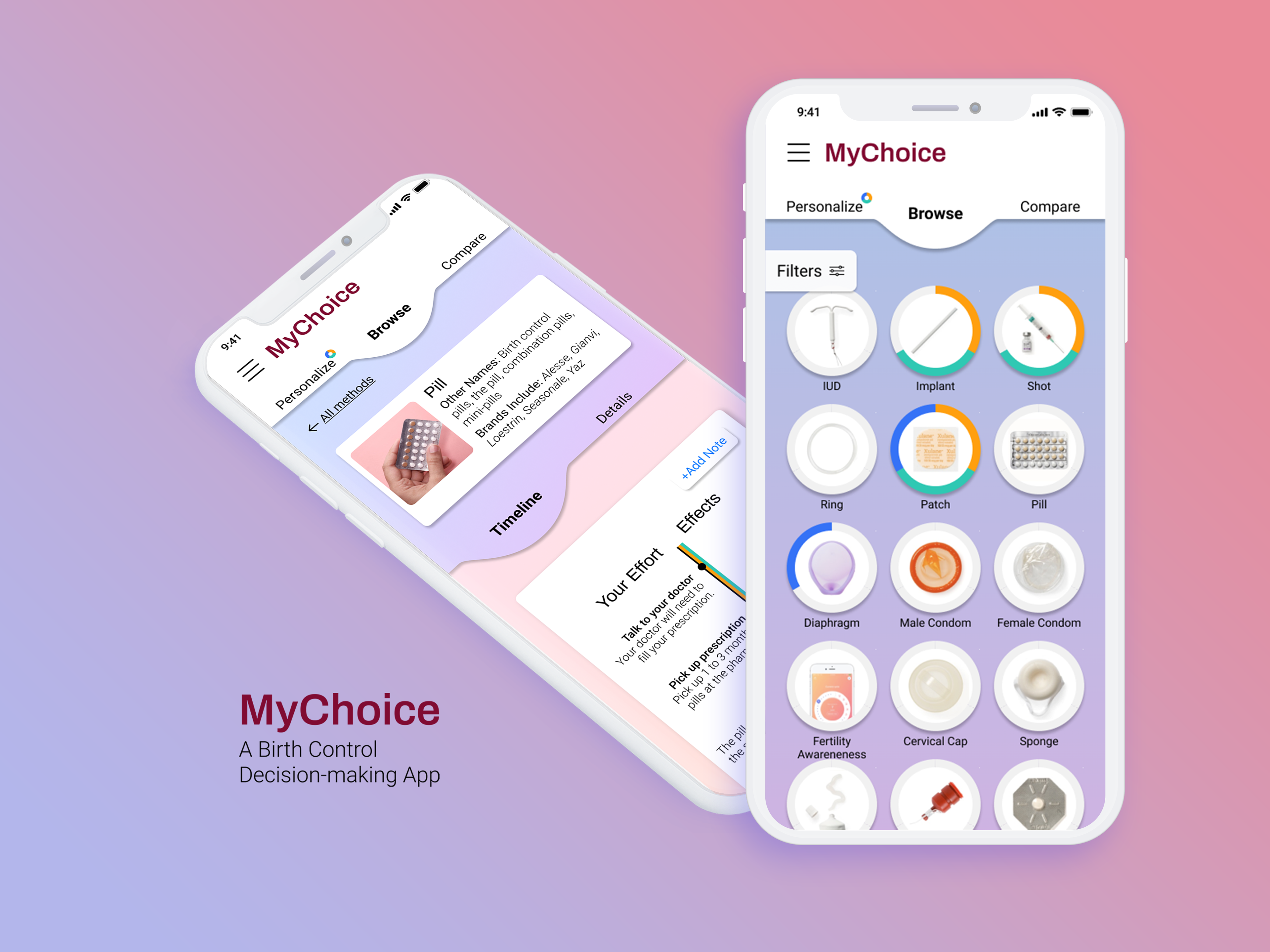
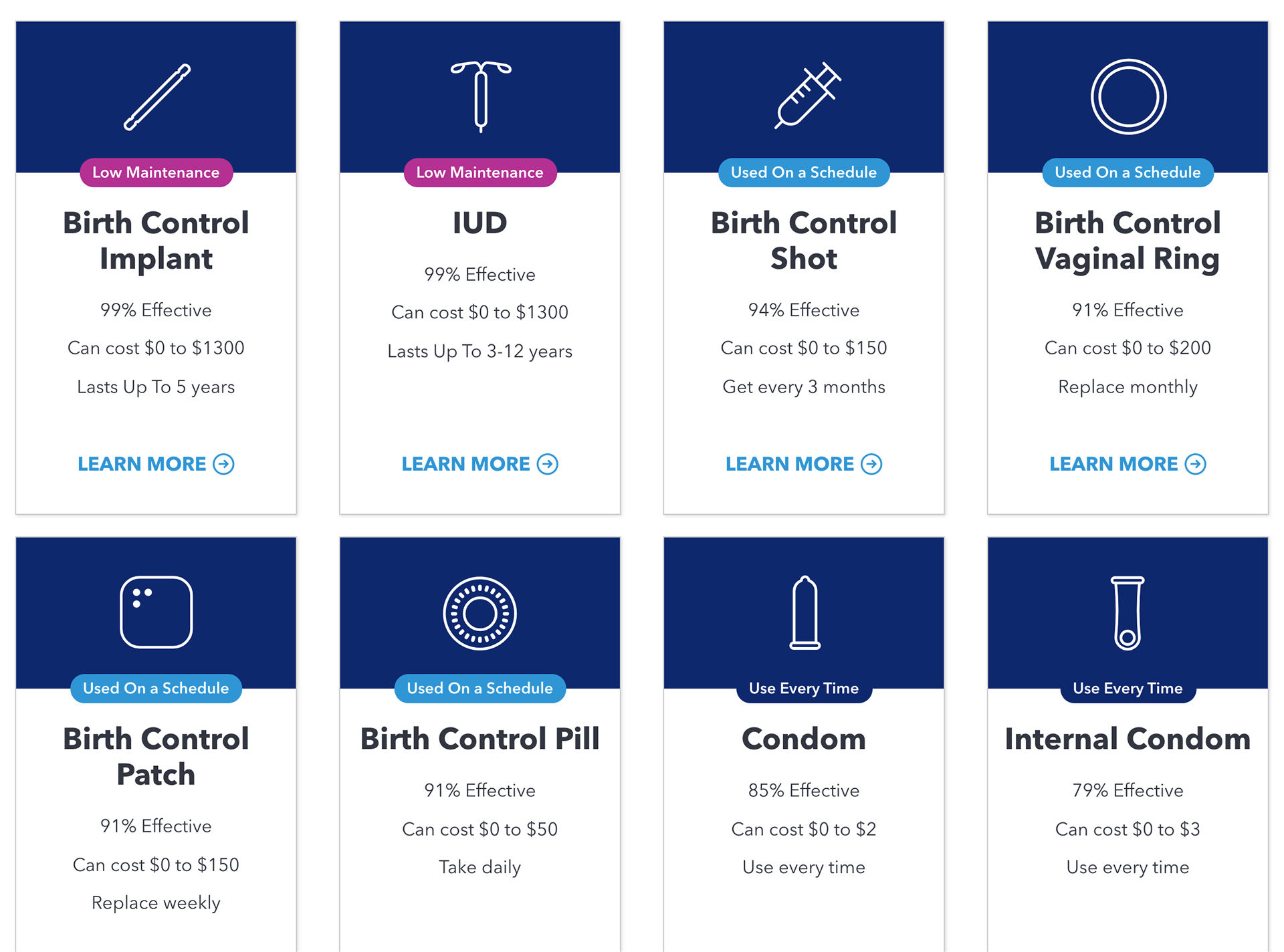
Final User Interface
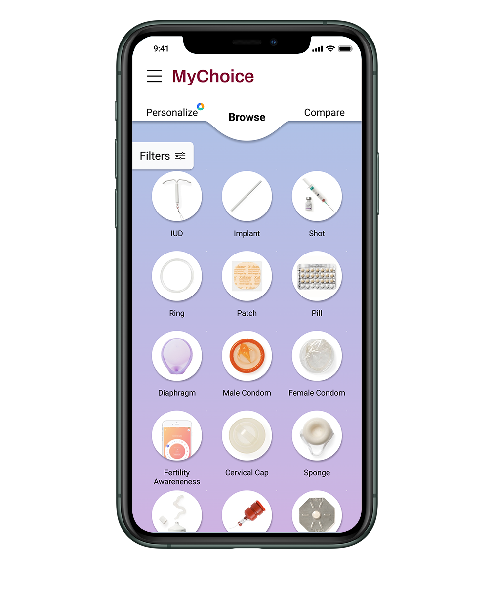
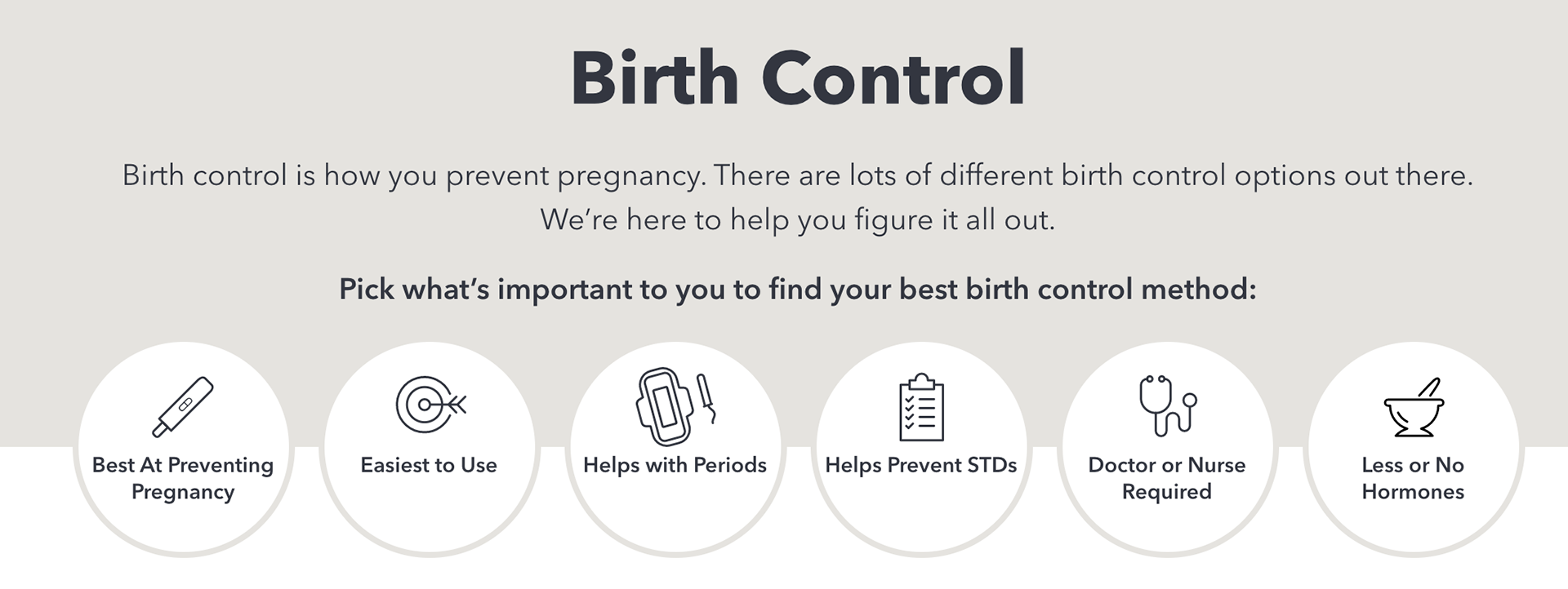
You Choose Your Path
In many birth control websites apps, we found that users were often prompted to take the personalization modules as part of the onboarding. In keeping with our principles of user agency, we wanted to make sure that users had direct access to information first, and guidance only upon request.
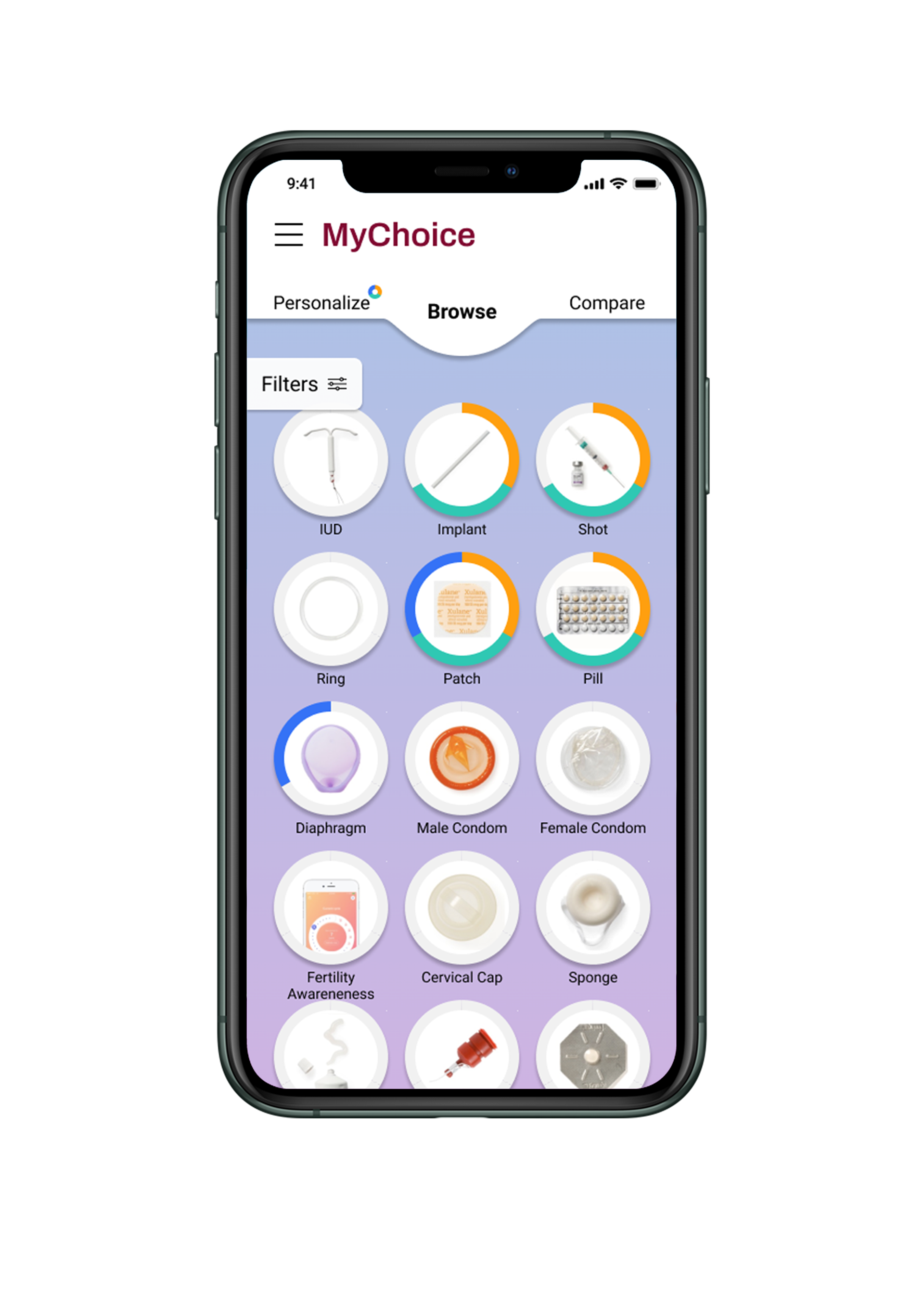
From here, the user can access
1. Filters to allow users to focus attention by commonly considered factors
2. Detailed information on a single birth control method
3. A Compare Page to quickly highlight differences in the details of two methods
4. A Personalization module to help highlight methods based on their preferences
What's in a Name?
As birth control has become more and more widely used, the language used to talk about birth control has become more diverse.
Many users hear about methods during conversation with peers or in non-medical contexts. At the same time, the medical terms for these methods change as new and updated forms enter the market.
To help orient the user, we provide an image of the method, and two sets of names to help bridge this language gap.
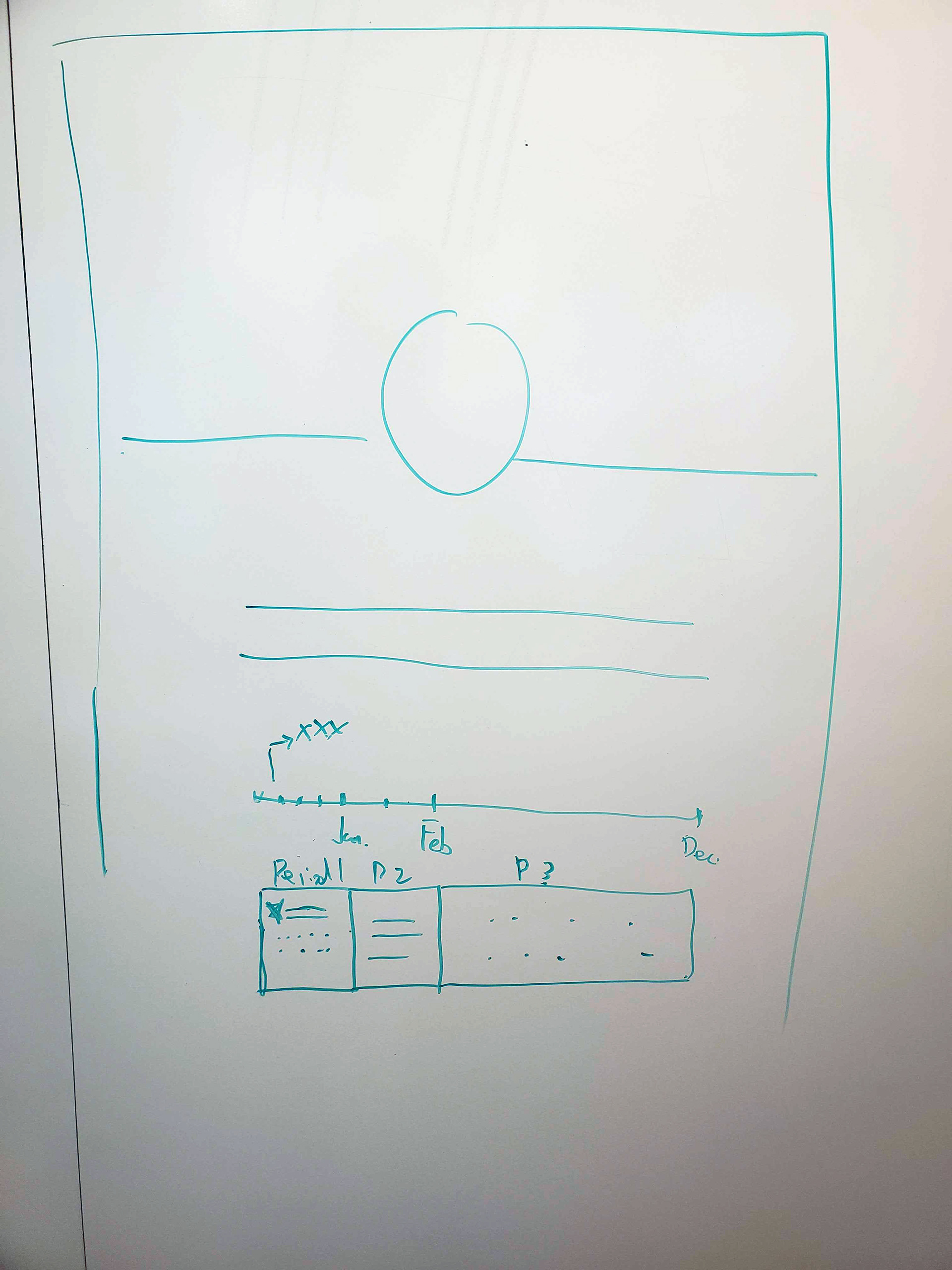
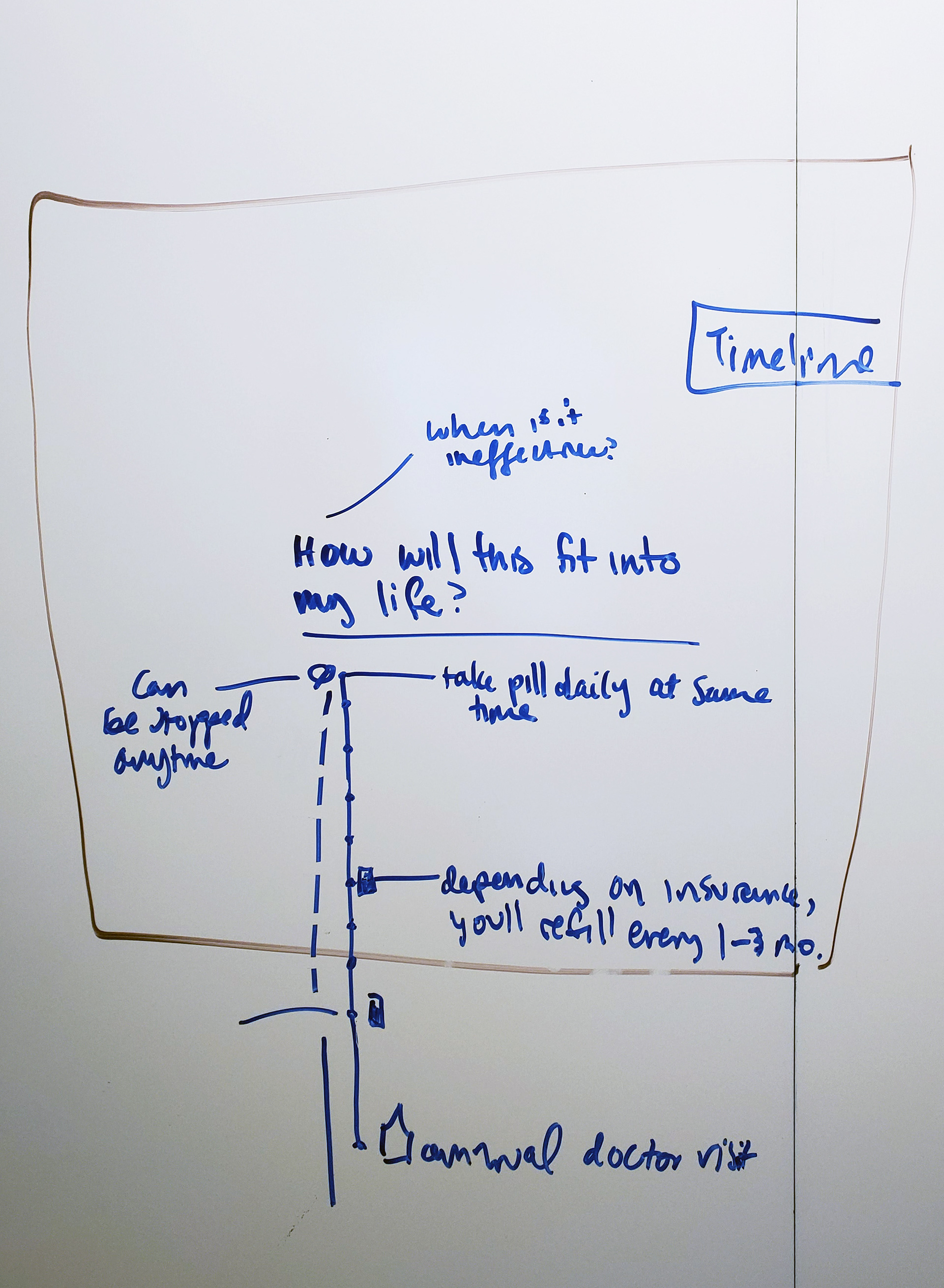
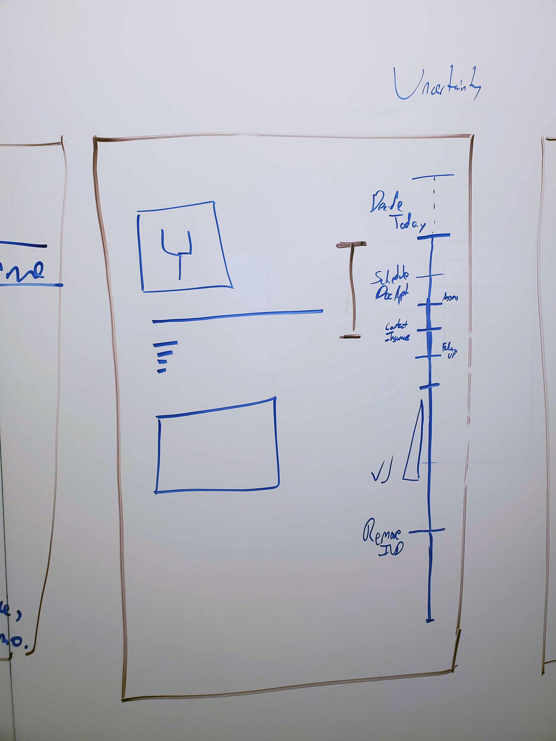
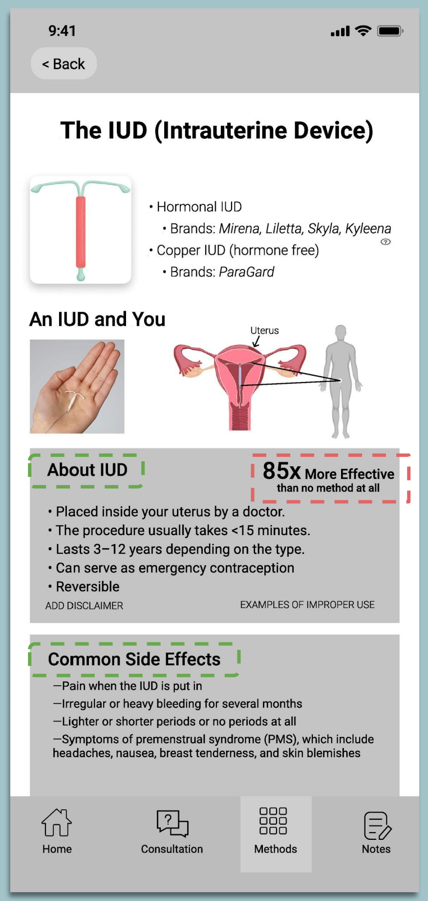
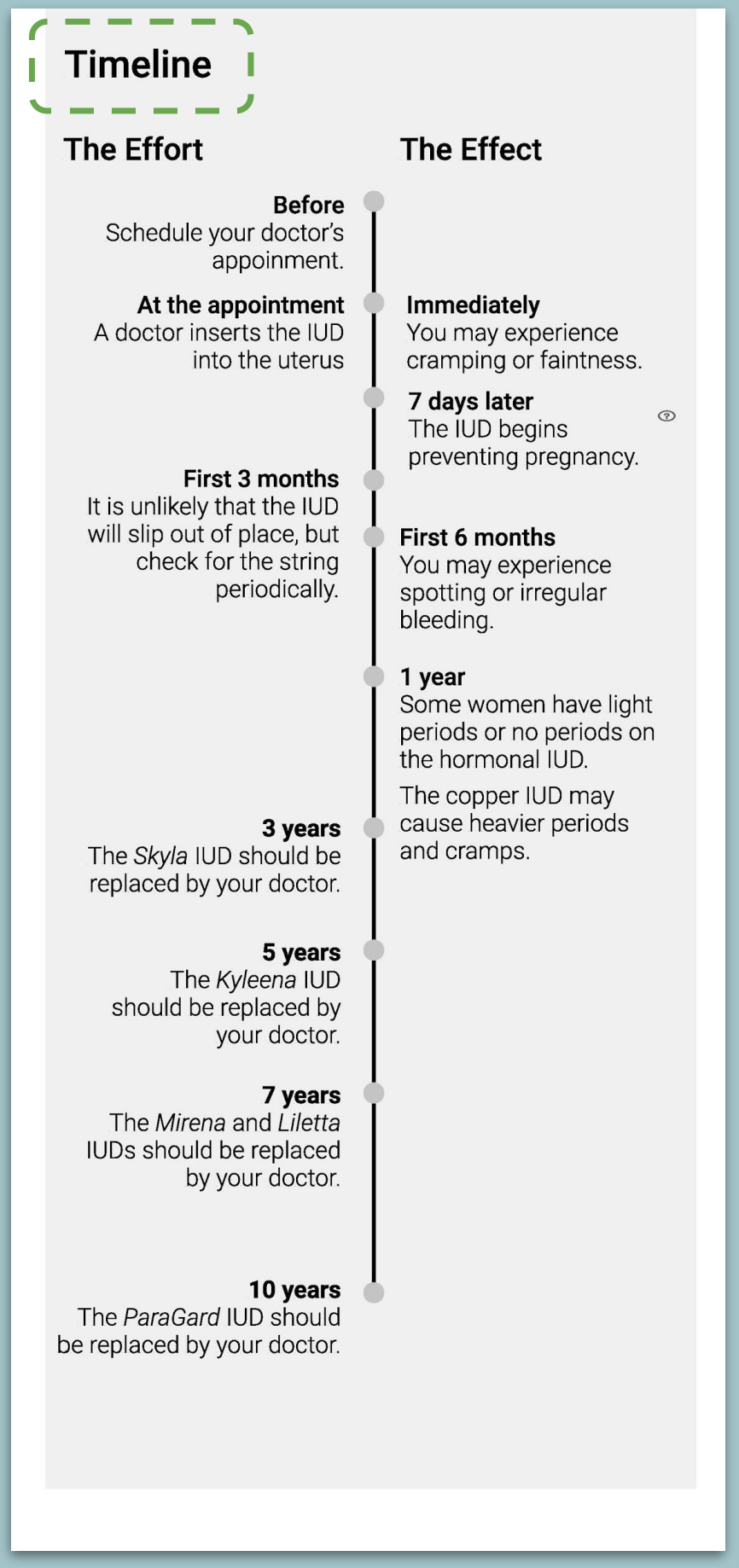
Setting Supportive Expectations
From what we heard in our user interviews, there were two persistent problems with how traditional tools handled birth control selection.
1. Most tools focus on medical details instead of addressing what to expect when using that method. This often led to confusion, anxiety and misinterpretation of events once a method was chosen.
2. Beyond acute side effects, many birth control methods vary over the longer term of their usage in how they're used and the work needed to maintain them.
To address these factors, we introduced the Timeline layout where users could see what their relationship with the birth control method would be over time.
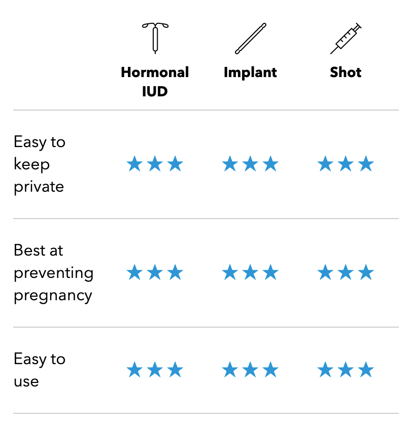
Progressive Disclosure
Once a user had started to browse information on several methods, we predicted that they might want to compare key attributes.
Handling the information architecture at this screen presented unique challenges for our team.
We settled on a stacked card motif to allow the high degree of compaction necessary for a mobile format, while also intuitively allowing users to disclose information at their own curiosity to avoid cognitive overload.
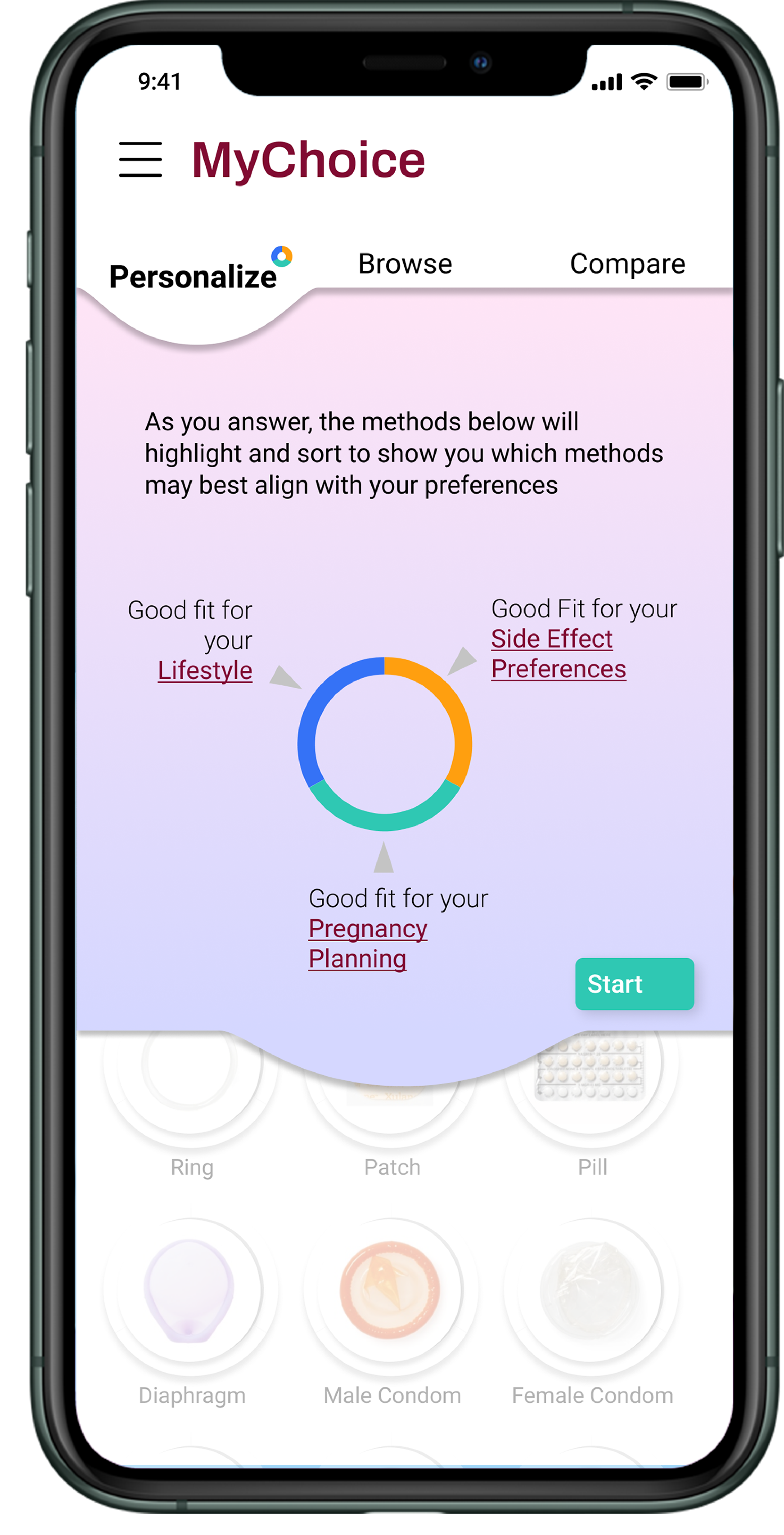
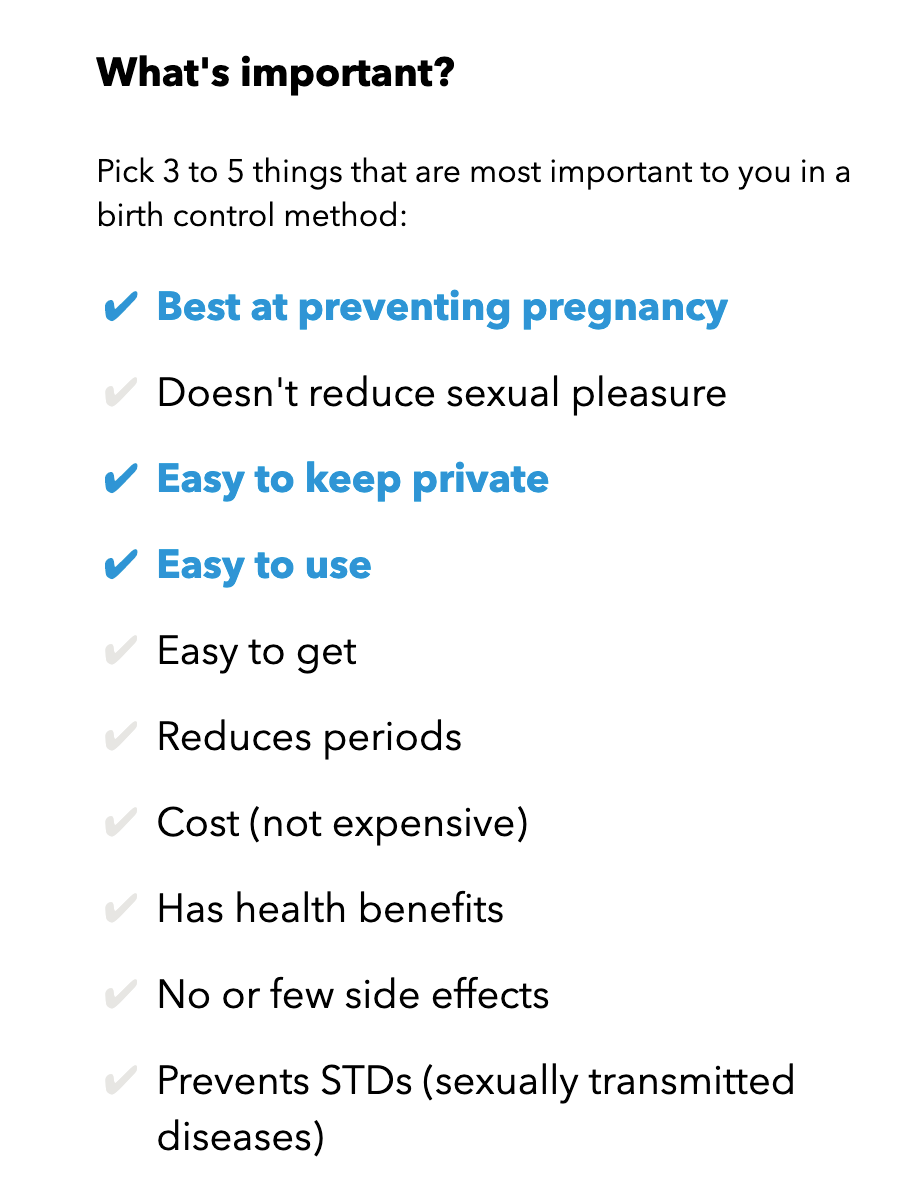
An Assessment You Can Trust
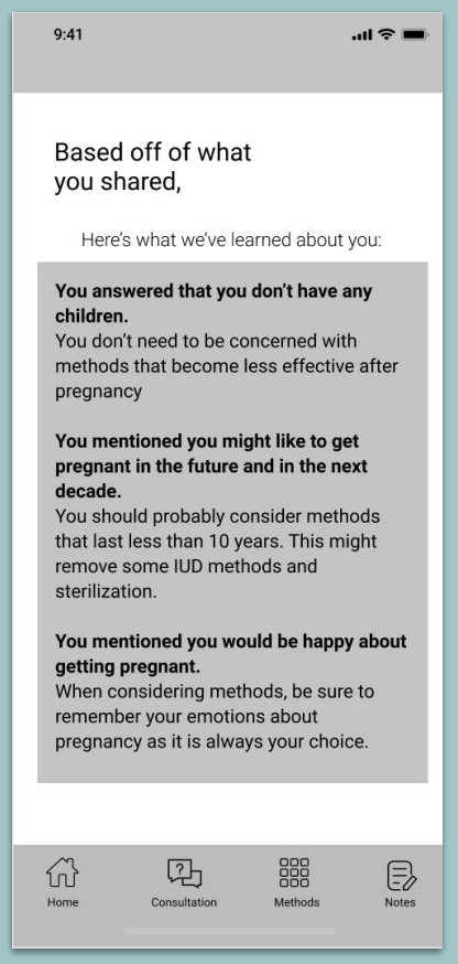
Although we wanted to focus on empowering our users, our interviews showed that many users would feel unsatisfied without some sort of recommendation.
At the same time, many users also expressed skepticism about recommendations that seemed too simple, pushy, or biased.
In particular, there appeared to be psychological distrust built when options were removed from view.
To strike the right balance, we devised a tagging system that could highlight certain methods without hiding away alternatives.
We called this non-destructive filter the Ring System.
Through a series of fully optional questions, users can enhance the display of methods that may be attractive based on their preferences without losing the full picture.